The wrong X image size does not just look awkward. It makes the idea harder to understand in the fastest feed on the internet.
A quote card with tiny attribution, a screenshot with unreadable UI, or a header image with important text near the edge can turn a good source into a throwaway visual. The fix is not memorizing every spec. The fix is choosing safe ratios and designing for timeline readability first.
Quick answer
The safest X image sizes to use in 2026
X/Twitter image size cheat sheet
X image sizes
Use the size guide as a practical posting checklist.
This Highlightly-generated comparison keeps the sizing advice tied to the real publishing decision: whether the image will remain readable in the timeline.

Use square when you are not sure.
A 1080x1080 graphic is the most forgiving format for source-backed quote cards, stat cards, and screenshots because it travels well across X, LinkedIn, Instagram, newsletters, and decks.
Timeline reality
Design for the preview, not the design file
Most people will see your image as a fast-moving preview before they decide whether to stop. That means the first test is not whether the image looks polished at full size. It is whether the main idea, number, or screenshot highlight is readable in the timeline.
Before posting any X image, check
- Can the main text be read on a phone without zooming?
- Is there one visual focal point?
- Is source attribution visible but compact?
- Does the crop hide anything important?
- Would the image still make sense if someone sees it before reading the caption?
Source-backed graphics
Quote cards, stat cards, and screenshots need different sizing choices
A stat card usually wants a square format: one number, one context line, one source. A screenshot may need landscape so the original UI or chart remains legible. A portrait graphic can work when the idea needs more vertical rhythm, but it should still avoid tiny text.
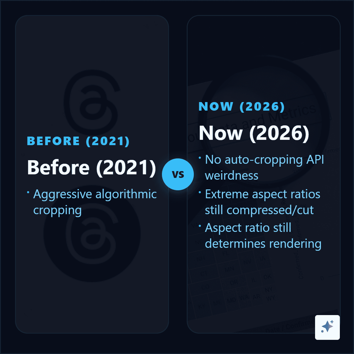
Manual X graphics vs Highlightly exports
Export controls
Highlightly keeps ratio choice close to the asset.
Use square when you need consistency, landscape for wide screenshots, and vertical formats when the idea needs more room.

Headers and profiles
Keep important content away from the edges
X profile photos are circle-cropped, so avoid text or logos that need square corners. Header images are wider and more fragile: device crops and profile overlays can hide edge content. Put the brand signal in the center and treat the sides as flexible background.
Threads
Use images in threads only when each image earns its place
A thread with four images can work beautifully when each image reveals a different proof point. It fails when the images are just decorative. Use image one for the strongest claim, image two for a screenshot or data point, image three for a comparison, and image four for the takeaway.
X image workflow for source-backed posts
Pick the source claim
Use an article, report, PDF, screenshot, or pasted text. Do not start from a blank visual.
Choose the asset type
Make a stat card for a number, quote card for a line, screenshot card for proof, or carousel-like thread for a sequence.
Choose the ratio
Use 1:1 for most cards, 16:9 for wide screenshots, and portrait only when the extra height helps readability.
Preview on mobile
Check the timeline crop and compression before publishing.
Create the image
Turn one sourced claim into an X-ready graphic.
Paste the source into Highlightly, choose the strongest quote or stat, export a square or landscape asset, and write the X caption around the proof.
Start freeThe best X image size is the one that keeps the proof readable.
Specs matter, but legibility matters more. Use standard ratios, keep the idea simple, and make sure the graphic can survive the timeline preview.
- Use square for most source-backed cards.
- Use landscape when the screenshot needs width.
- Keep attribution visible without letting it dominate.
Frequently asked questions
Research sources