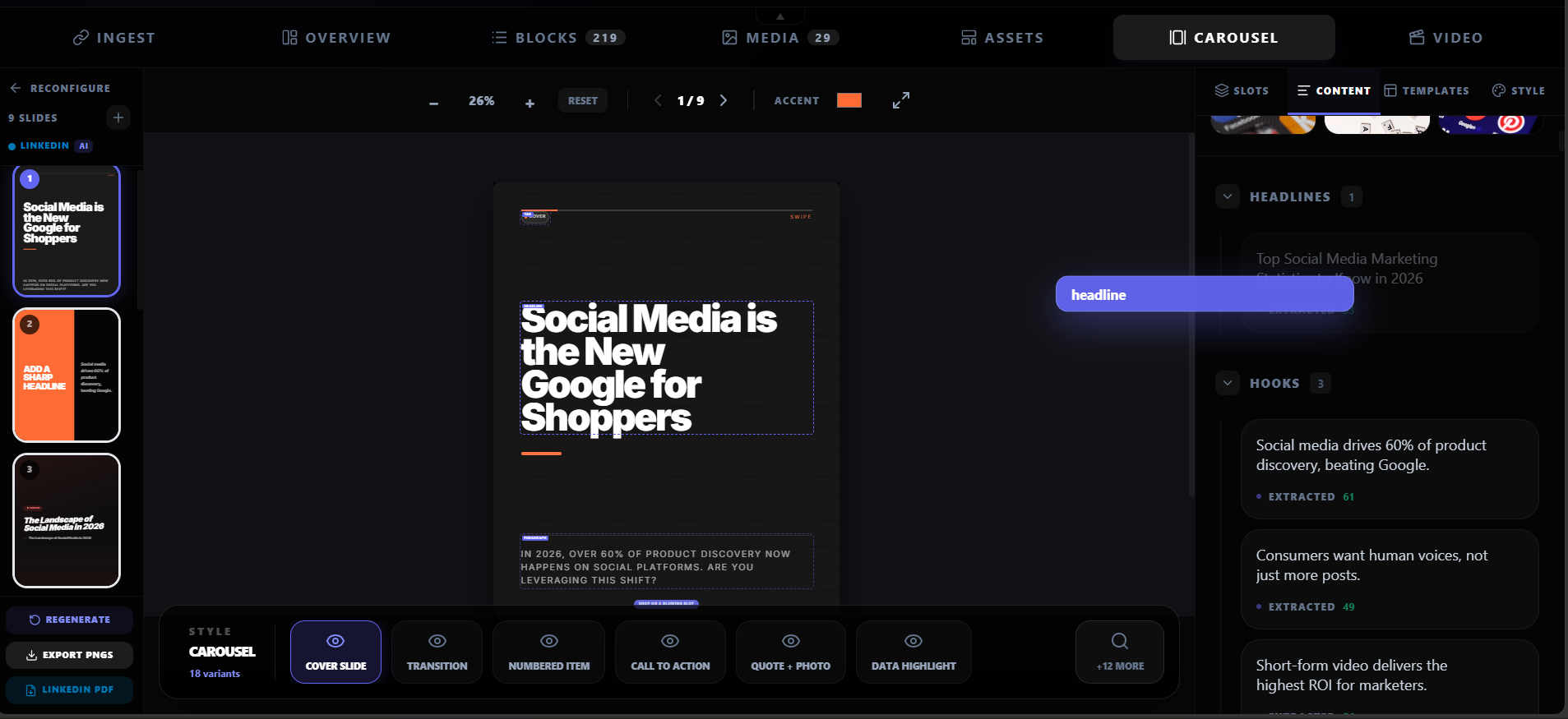
LinkedIn carousels are document posts — you upload a file and LinkedIn renders it as a swipeable sequence in the feed. The format, dimensions, and slide count all affect how the carousel performs. Get the size wrong and your slides get cropped, blurry, or awkwardly formatted.
LinkedIn carousels are document posts, not image posts.
You upload a PDF, PPT, PPTX, DOC, or DOCX file. LinkedIn renders the pages as swipeable slides in the feed. The file format and slide dimensions determine how the carousel looks on desktop and mobile.
Dimensions
The exact slide dimensions for LinkedIn carousels
LinkedIn carousel slide dimensions
The 1080x1080 square format is the most common choice because it works well on both desktop and mobile. The 1080x1350 portrait format is gaining popularity because it takes up more vertical space in the mobile feed, which means more attention.
File formats
PDF vs PPT vs images: which format to use
LinkedIn carousel file format comparison
Slide limits
How many slides should a LinkedIn carousel have?
LinkedIn supports up to 300 pages per document post, but that does not mean you should use all 300. The practical range for carousels is 5-10 slides. Each slide should carry one idea, and the sequence should build toward a clear takeaway.
Slide count guidelines
- 5-7 slides: best for a single argument, framework, or comparison.
- 8-10 slides: best for step-by-step guides, listicles, or detailed breakdowns.
- 10-15 slides: only if every slide earns its place. More slides = more chances to lose the reader.
- 15+ slides: rarely works. The reader will not finish unless the content is exceptional.
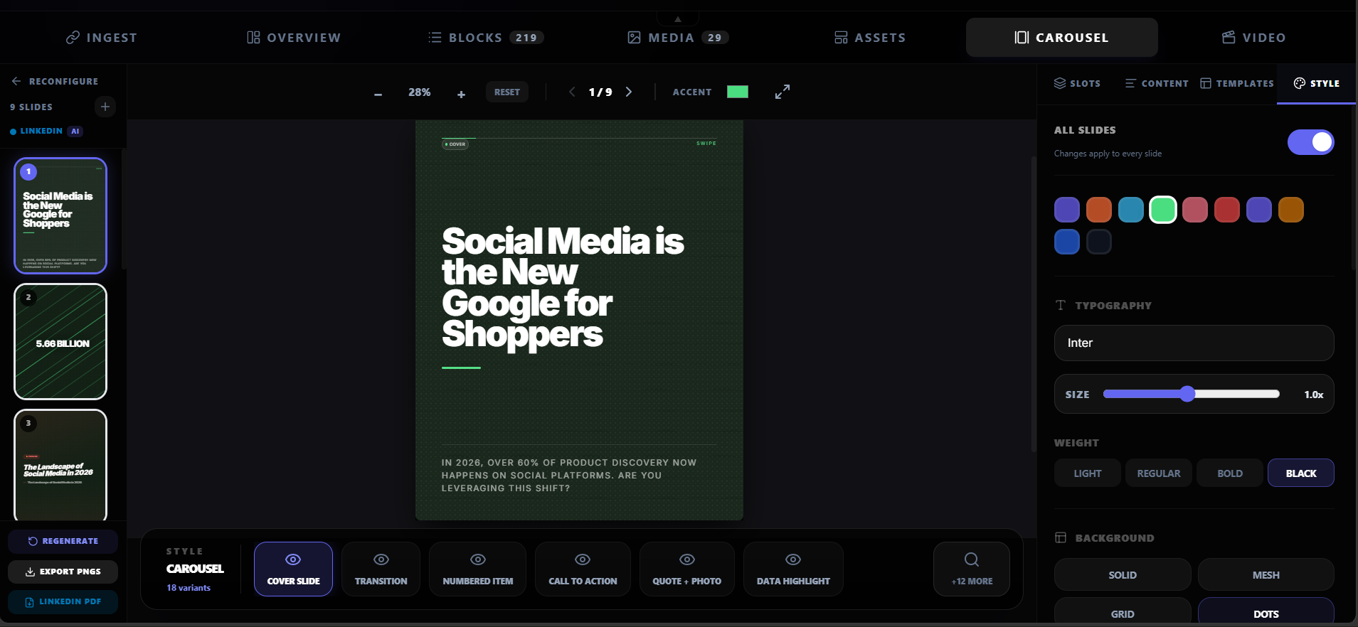
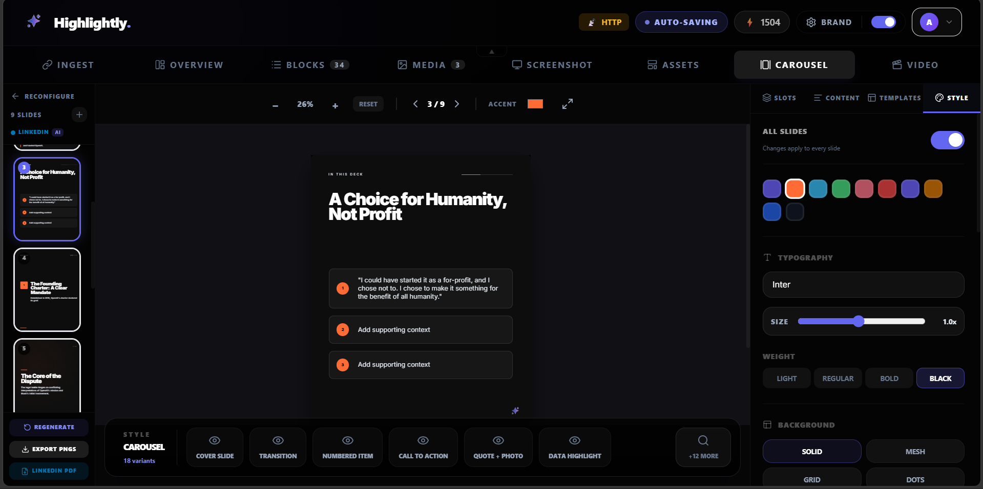
Design rules
Design best practices for LinkedIn carousel slides
Design rules that improve carousel engagement
One idea per slide
If you need two sentences to explain the point, you need two slides. Do not cram multiple ideas onto one slide.
Large text
Minimum 24pt for body text, 32pt or larger for headers. Most LinkedIn users browse on mobile — small text is unreadable.
High contrast
Dark text on a light background or light text on a dark background. Avoid low-contrast color combinations.
Consistent branding
Same colors, fonts, and logo on every slide. The carousel should look like part of a system, not a random collection.
Minimal design
Do not over-decorate. The content is the design. Use whitespace generously and avoid cluttered layouts.
From source to carousel
How to create a LinkedIn carousel from an article or report
The fastest way to create a source-backed carousel is to start with existing content. Extract the key points, map each to a slide, apply your brand, and export as PDF.
Article-to-carousel workflow
Choose your source
Paste a URL, upload a PDF, or add text. The source should have a clear argument, useful data, or actionable steps.
Extract the key points
Identify 5-7 strong points from the source: quotes, statistics, steps, frameworks, or comparisons.
Map points to slides
Each point becomes a slide. The first slide is the hook. The last slide is the takeaway or CTA.
Apply brand kit
Add your colors, fonts, logo, and watermark. Consistency matters when multiple carousels appear in someone's feed.
Export as PDF
Export at 1080x1080 or 1080x1350. Upload the PDF as a LinkedIn document post.
Create a carousel
Build a LinkedIn carousel from any source.
Paste a URL, upload a PDF, or add text. Highlightly extracts the key points and turns them into branded carousel slides ready for LinkedIn.
Create a carouselCarousel anatomy
A strong carousel needs the right dimensions and format.
Use 1080x1080 (square) or 1080x1350 (portrait) per slide. PDF is the most reliable format. Keep 5-10 slides with one idea per slide.
Slide design
Design rules that improve carousel engagement.

Frequently asked questions
Research sources