
A strong LinkedIn carousel is not a blog post cut into rectangles. It is a sequence. Slide one earns attention. Slides two through seven make the argument. The final slide gives the reader a reason to save, share, comment, or click through.
LinkedIn's own help pages describe document posts as a way to upload files such as PDFs, PPTs, DOCs, and DOCX files. LinkedIn recommends high-quality documents for knowledge sharing, insights, trends, event content, and similar material. That is exactly why blog-to-carousel workflows work: they turn long-form knowledge into a format people can skim, swipe, and save.
Step one
Pick an article with a real spine.
The best source articles have structure. Look for a clear thesis, a list of steps, a research finding, a mistake to avoid, a before-and-after story, a quote from a credible person, or a statistic that changes the reader's mind. If an article is vague, your carousel will be vague too.
Good carousel source signals
- A strong claim that can become the hook slide.
- Three to seven supporting points.
- At least one quote, statistic, or concrete example.
- A clear audience: founders, marketers, operators, creators, analysts, or buyers.
- A useful next action for the reader.
Step two
Extract before you design.
This is where most manual workflows slow down. People open the article, highlight ten things, paste them into a doc, rewrite them into bullets, forget the original source, then open a design tool and start over. Instead, extract the useful units first: hook, key points, quotes, statistics, facts, attribution, caption angles, screenshots, and possible carousel modes.
A clean blog-to-carousel workflow
Choose one angle
Do not try to summarize the whole article. Pick one useful argument the audience can understand in one swipe sequence.
Build the slide spine
Slide one is the hook. The middle slides each carry one idea. The final slide gives a takeaway or next step. Decide whether the carousel should be source-backed, polished from the article, screenshot-led, or complemented with extra context.
Add proof
Use one or two proof points: a quote, statistic, screenshot, or citation line.
Apply brand
Use consistent colors, typography, logo, watermark, and spacing so the carousel looks like part of a system.
Write the post caption
The caption should introduce the problem, tee up the carousel, and credit the source when needed.
Manual workflow vs Highlightly workflow
Carousel anatomy
A useful carousel usually has a strong opening slide, proof or context in the middle, a clear final takeaway, and a small source attribution area when the material comes from a specific article or report.
Who should care
- Writers: turn one article into a focused carousel without flattening the argument into a generic summary.
- Marketers: create a reusable blog-to-social workflow for campaigns, launches, newsletters, and thought leadership.
- Video editors: reuse the same hook, proof points, and slide structure as short-form video beats.
- Brands: keep every carousel aligned with brand kit, attribution rules, and platform ratios.
- Creators: make saveable posts from existing work instead of inventing a new idea every day.
The repeatable recipe
The best carousel workflow separates selection from design. First decide what is worth publishing. Then choose the mode: direct proof, polished summary, screenshot-led, or complementary context. Finally apply brand and export. Highlightly exists to make that repeatable from any strong article, PDF, report, or transcript.
- One source.
- One clear angle.
- One idea per slide.
- Visible proof and attribution.
- Branded export plus caption.
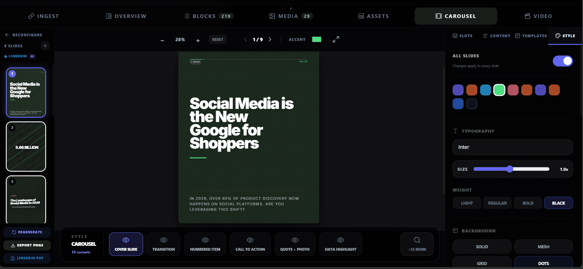
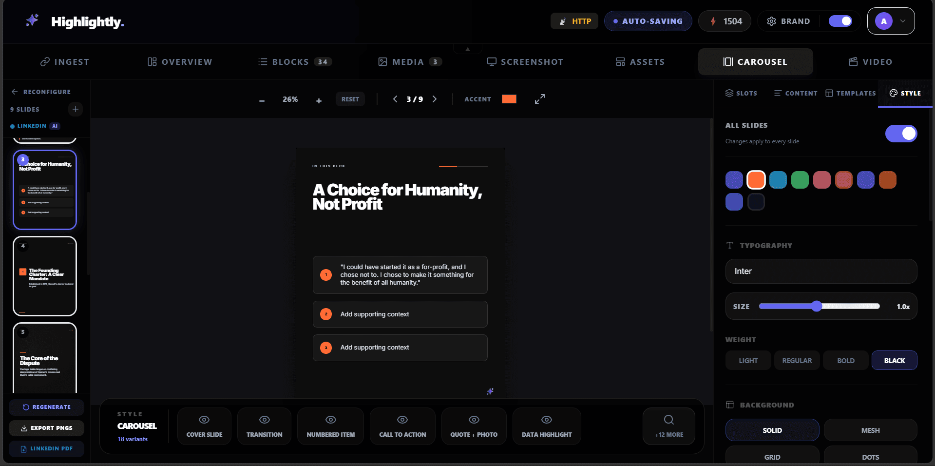
Carousel builder
A LinkedIn carousel needs a spine, not a pile of excerpts.
Start with one angle, turn the post into slide beats, add proof, apply brand controls, then export the document-ready PDF sequence.
Preparing carousel preview
Loading the PDF export from static assets.
Editing controls
Keep the carousel editable until the story works.
Frequently asked questions
Research sources