The best Instagram carousel does not feel like a blog post squeezed into squares.
It feels like the useful part of the blog was translated for a phone: faster, more visual, easier to save, and clear enough to understand while swiping.
Strategy
Start with one angle, not the whole article
A blog post may contain several ideas: a hook, a framework, supporting examples, a statistic, a quote, a checklist, and a conclusion. An Instagram carousel usually needs one of those angles, not all of them.
Good blog-to-carousel angles
- A five-step process from the article.
- A mistake-and-fix sequence.
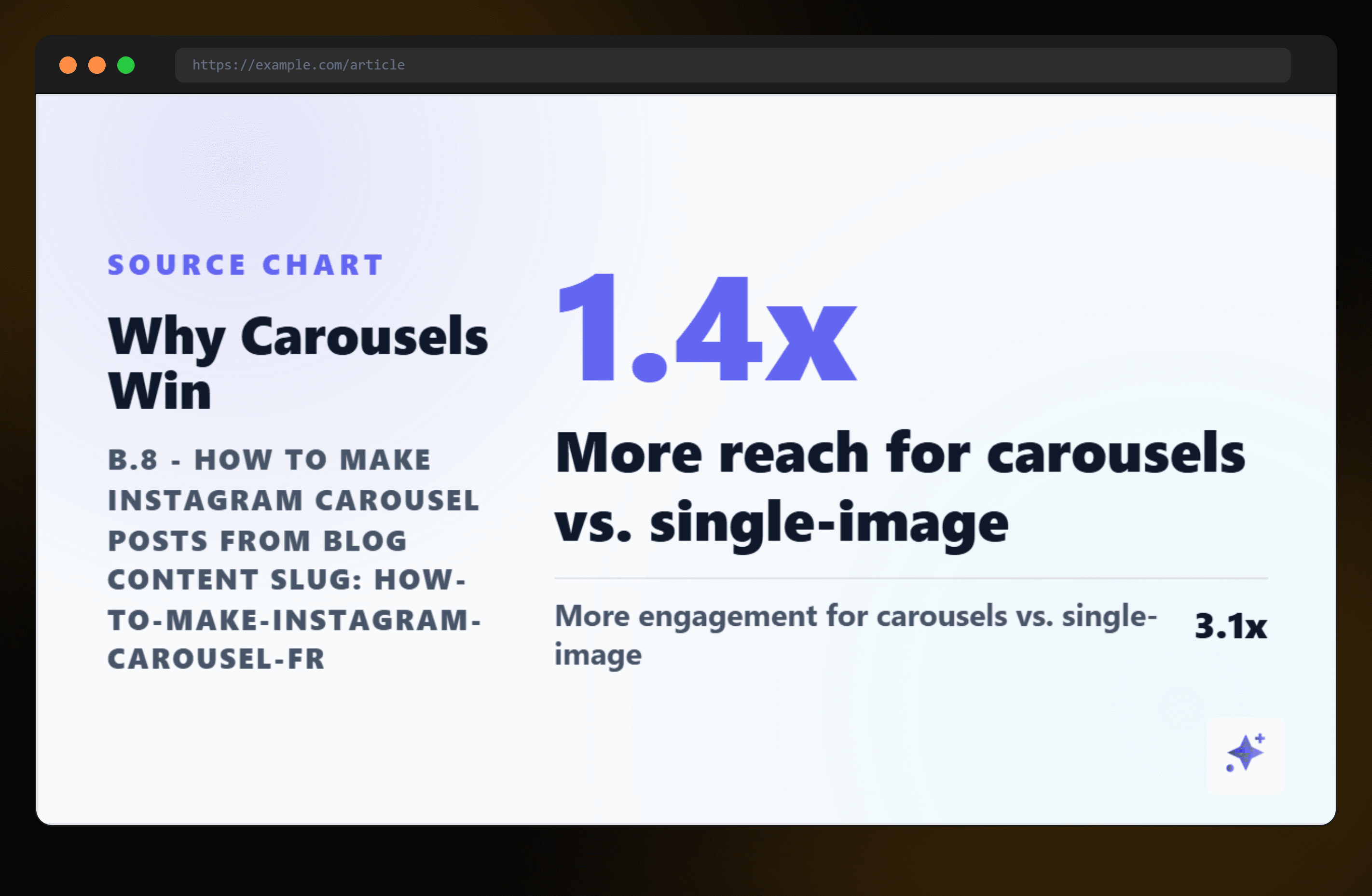
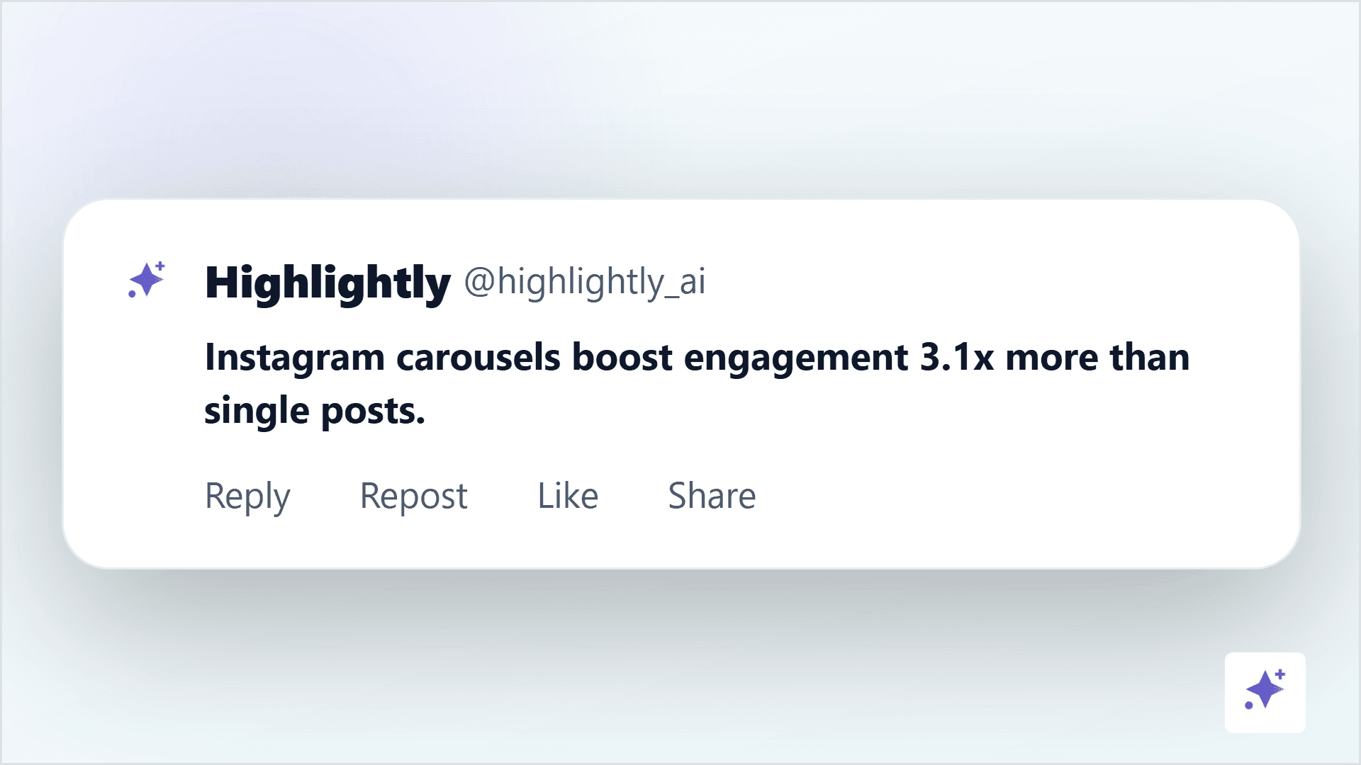
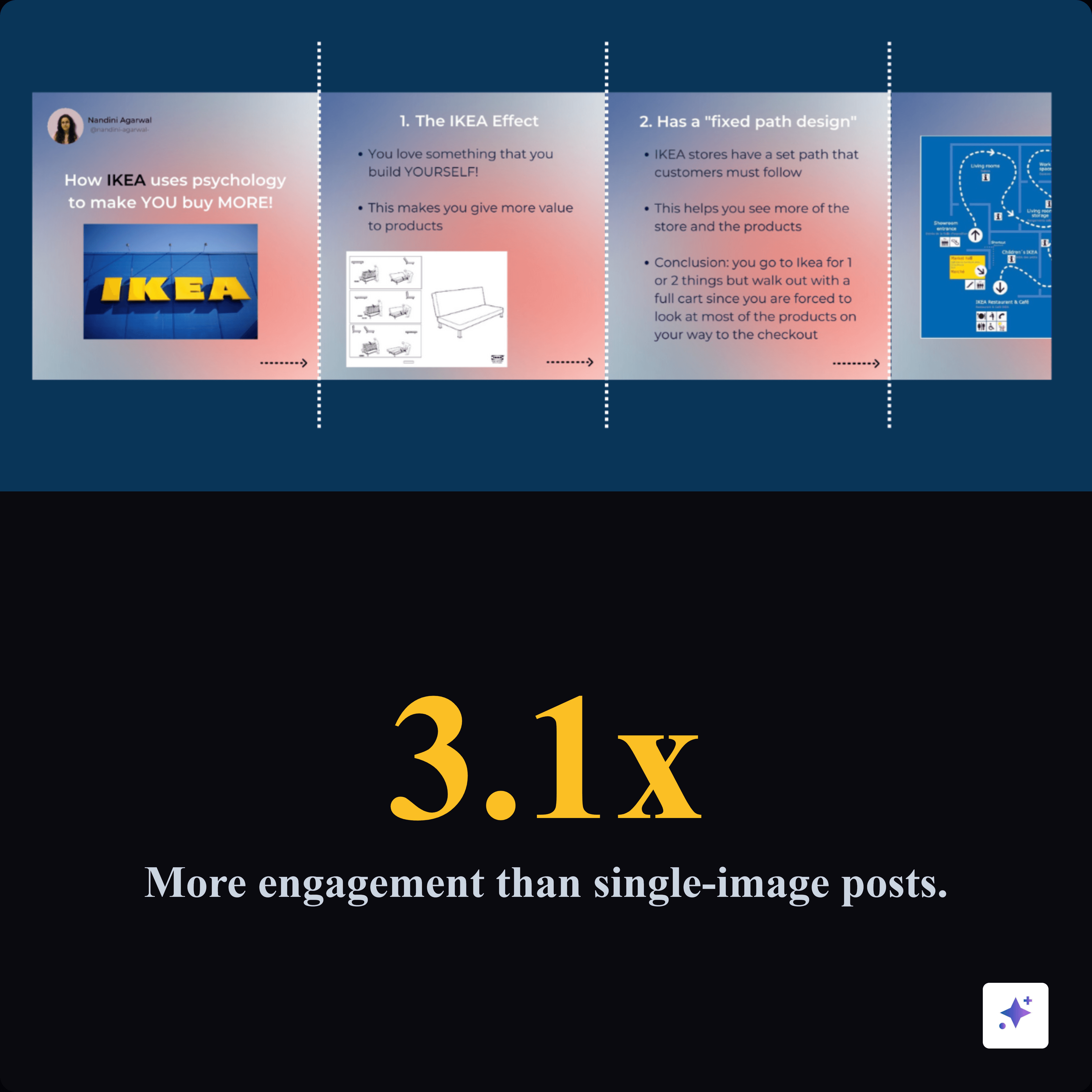
- A surprising statistic with context.
- A checklist readers will want to save.
- A before-and-after transformation.
- A set of examples that teach one pattern.
Specs
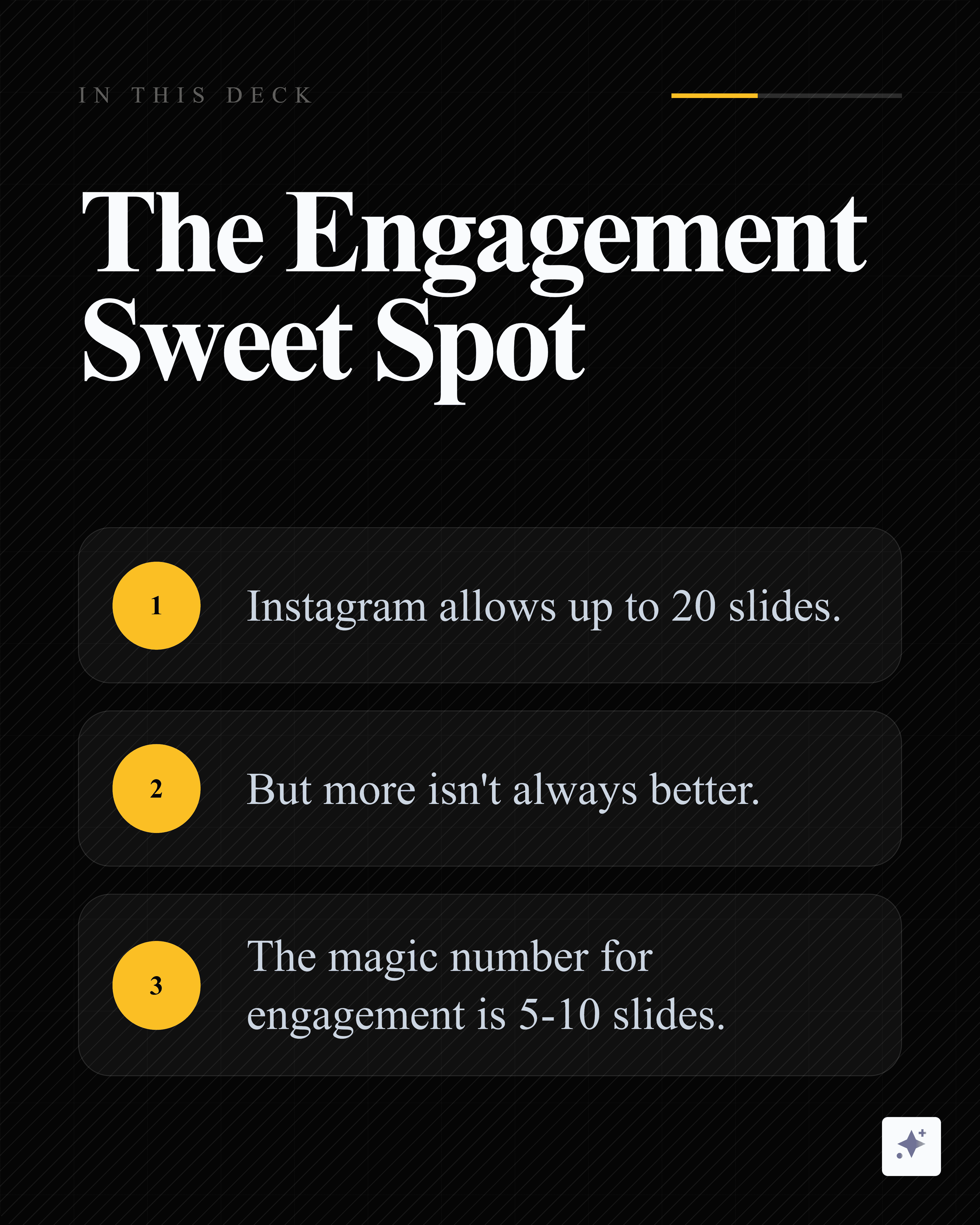
Instagram carousel dimensions and slide count
Source-to-carousel workflow
Start with the blog, then extract one carousel-worthy angle.
This workflow graphic frames the blog as source material, not a slide-by-slide script.
Instagram carousel practical specs
Adaptation
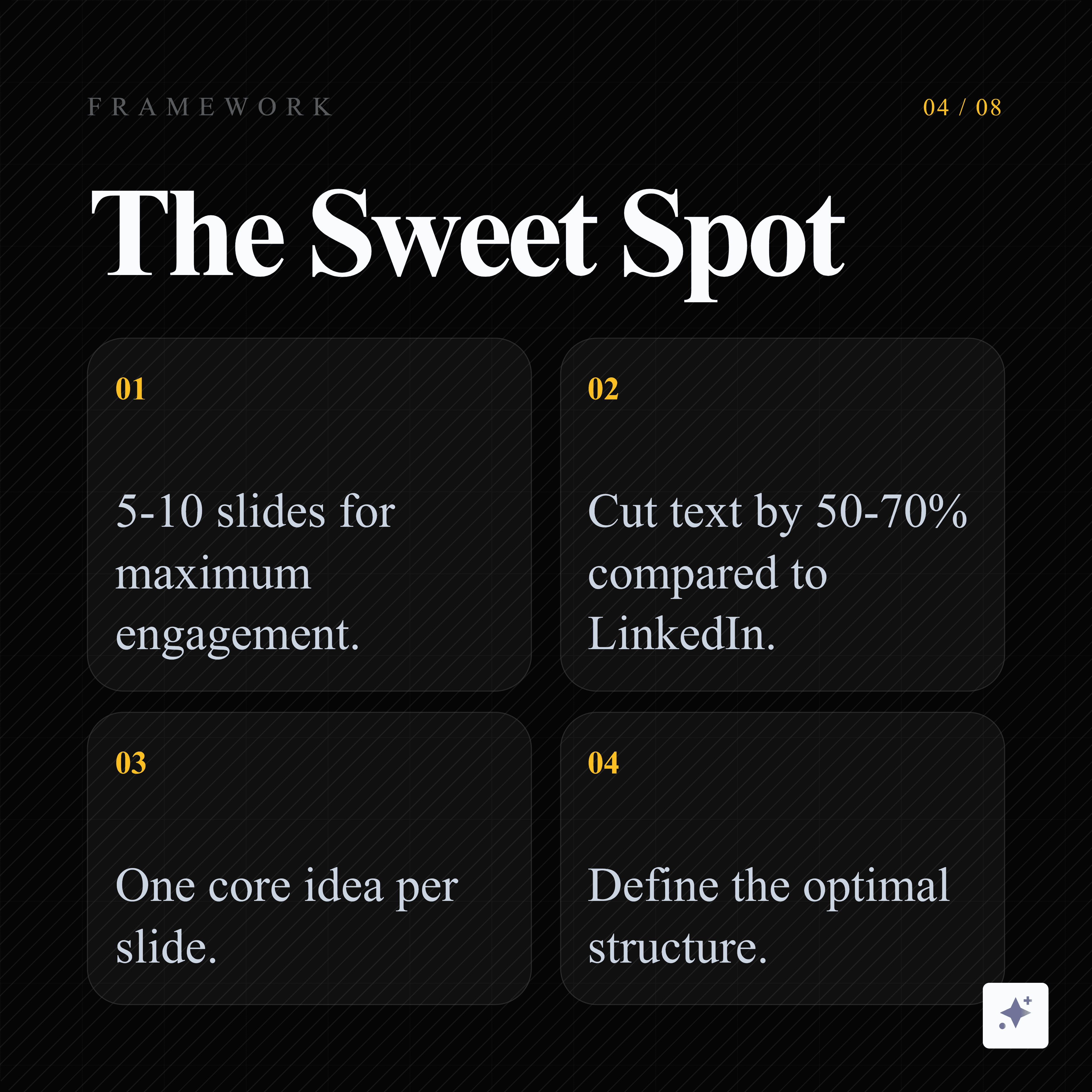
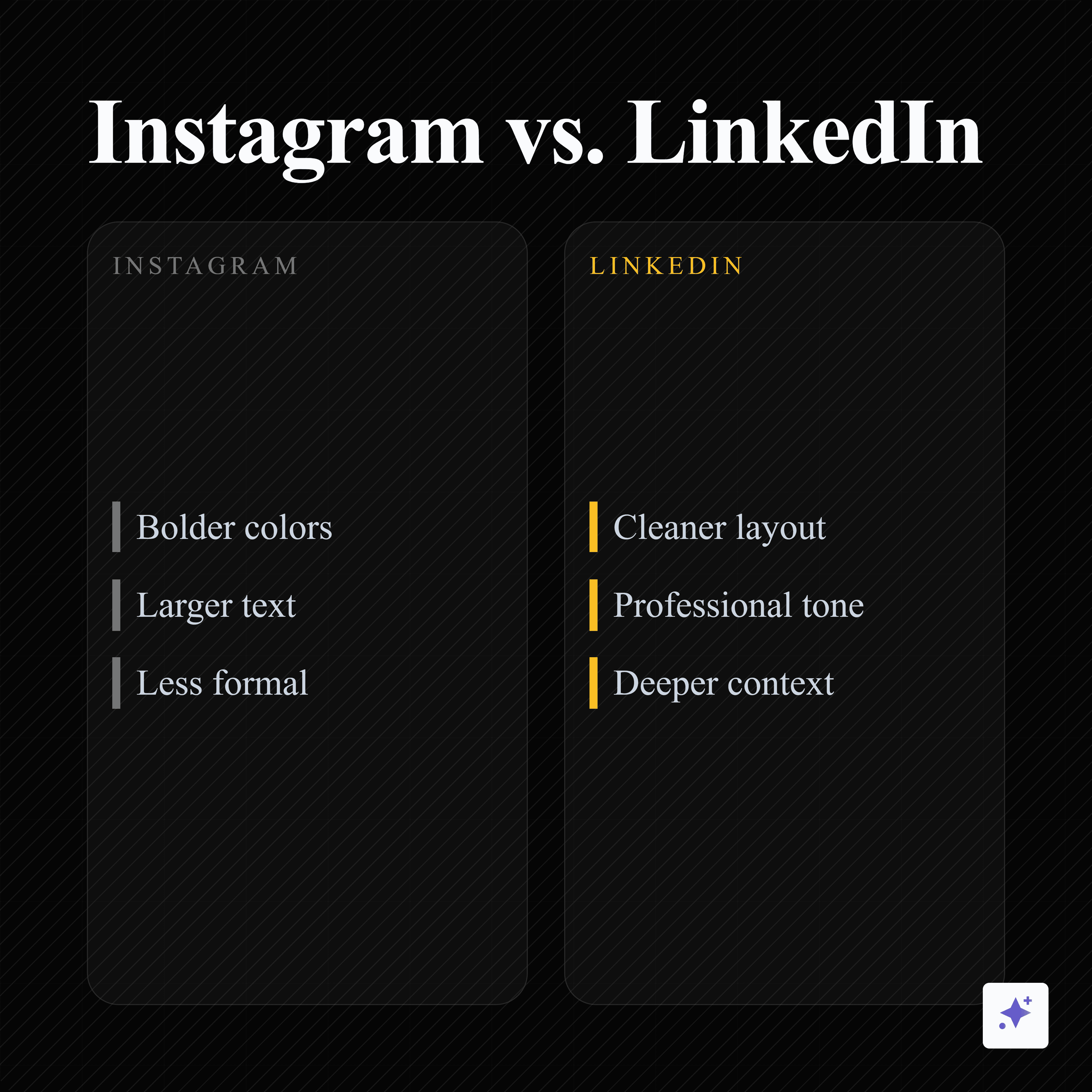
Compress the blog harder than you would for LinkedIn
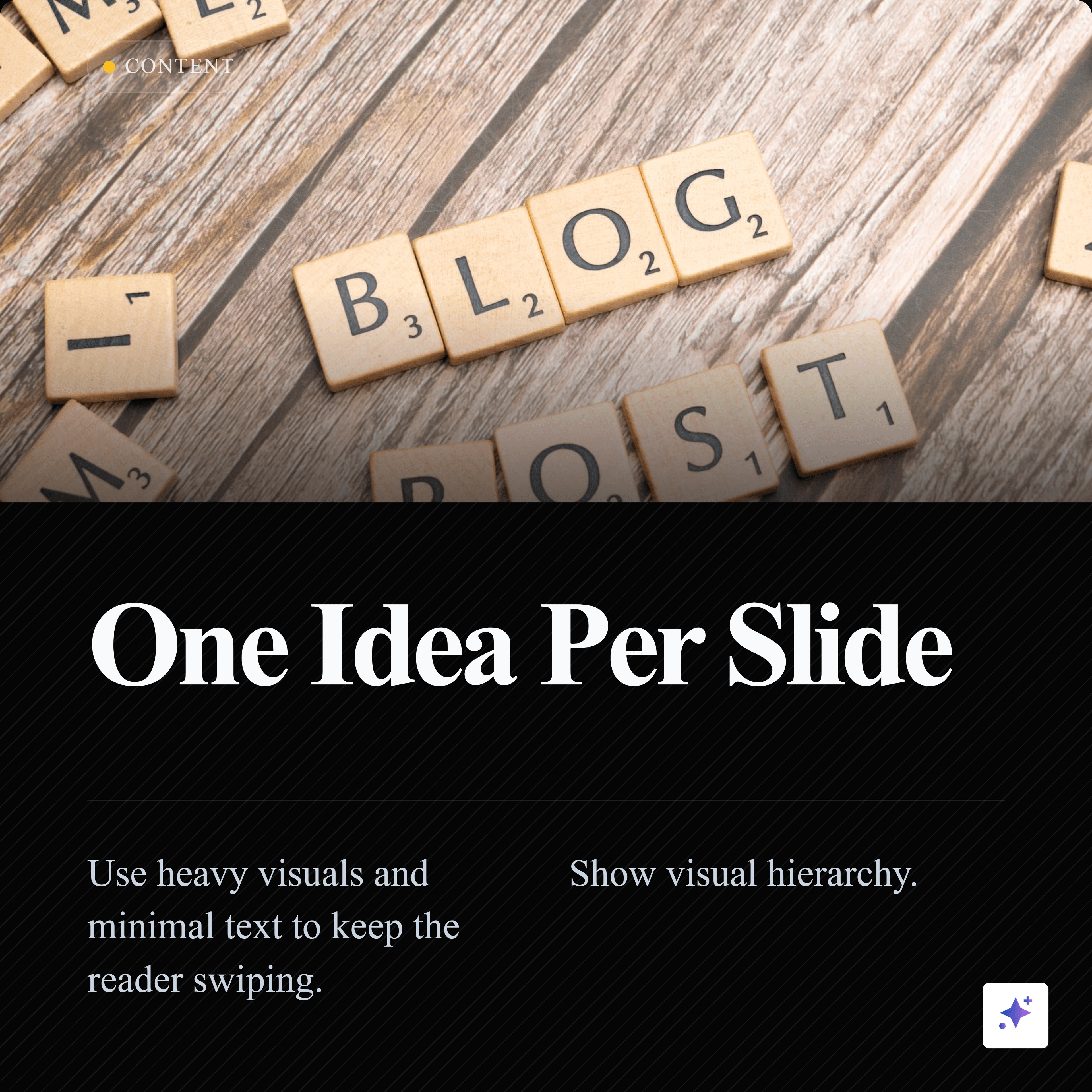
Instagram users are comfortable learning from visual explainers, but the slide has to work quickly. Cut the text by 50-70 percent compared with a LinkedIn carousel. Use bigger type, stronger visual hierarchy, and fewer concepts per slide.
If a slide needs a paragraph, it is not ready for Instagram.
Rewrite it as a headline, proof point, visual example, or short takeaway. Move nuance into the caption or a follow-up slide.
Instagram carousel
A 9-slide square Instagram carousel from the blog angle.
Use square slides when you want a carousel that can travel across Instagram, LinkedIn, and other feeds without rebuilding the entire design.

Structure
Use a cover, body, payoff sequence
Blog to Instagram carousel workflow
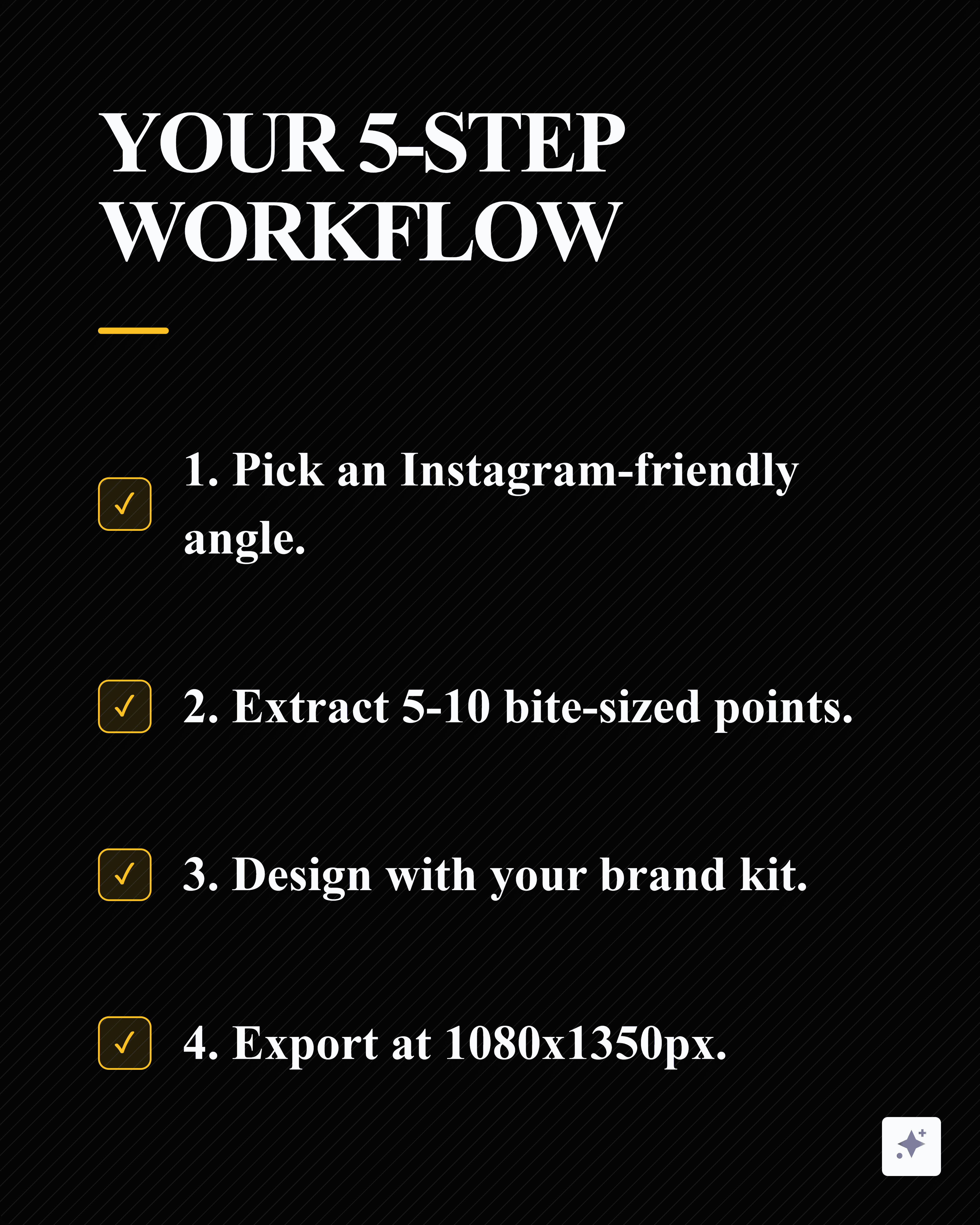
Extract the strongest angle
Find one blog section, checklist, mistake, statistic, or framework worth turning into slides.
Write the cover promise
Make slide one specific enough to earn the swipe.
Create 5-8 body slides
Give every slide one point, example, or proof item.
Add a payoff slide
End with a summary, save prompt, or next step.
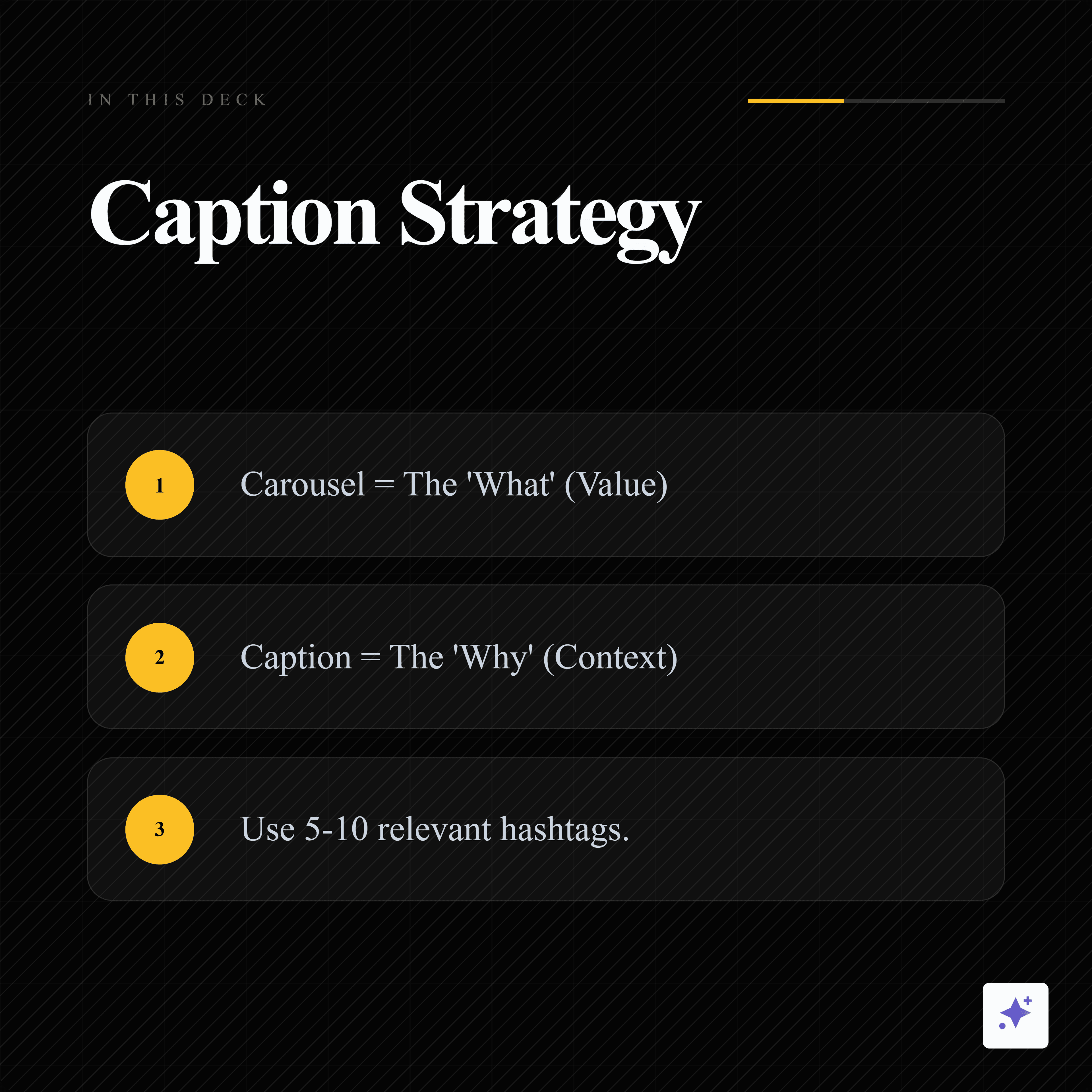
Write the caption
Add context, source notes, hashtags, and a reason to save or share.
Pattern
What big visual education pages teach us
Business, news, finance, and education accounts have trained audiences to learn through swipeable visuals. The lesson is not to copy their style. The lesson is that useful information travels when it is packaged into a repeatable visual format.
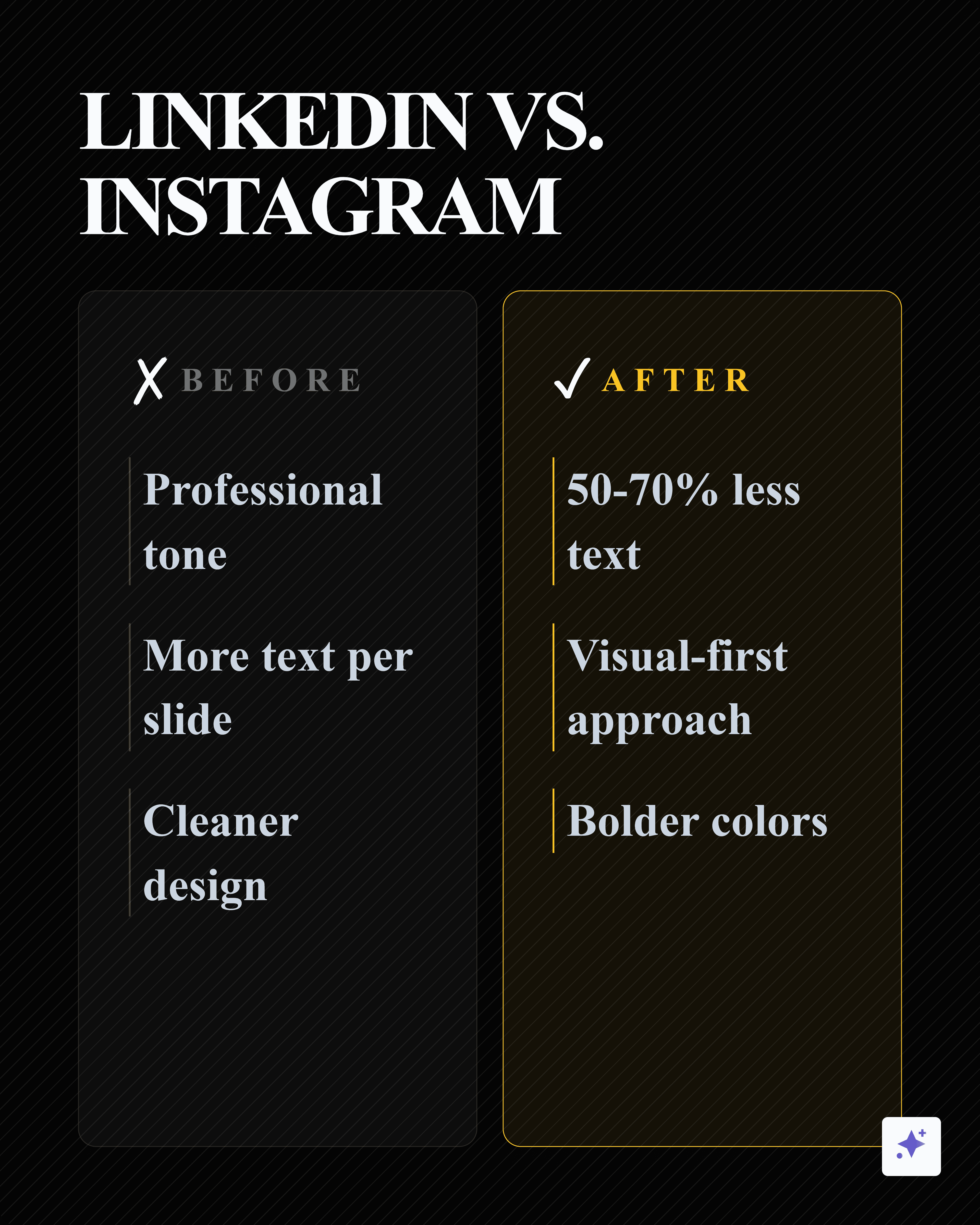
LinkedIn adaptation
The same source can become a LinkedIn carousel with more room for context.
This second carousel keeps the source-backed sequence but adapts the dimensions and density for LinkedIn.


You do not need to become a media company to use the same pattern. If your team already publishes blogs, reports, articles, transcripts, or research, Highlightly can extract the strongest points and turn them into source-backed cards and carousel drafts.
LinkedIn carousel vs Instagram carousel
Tooling
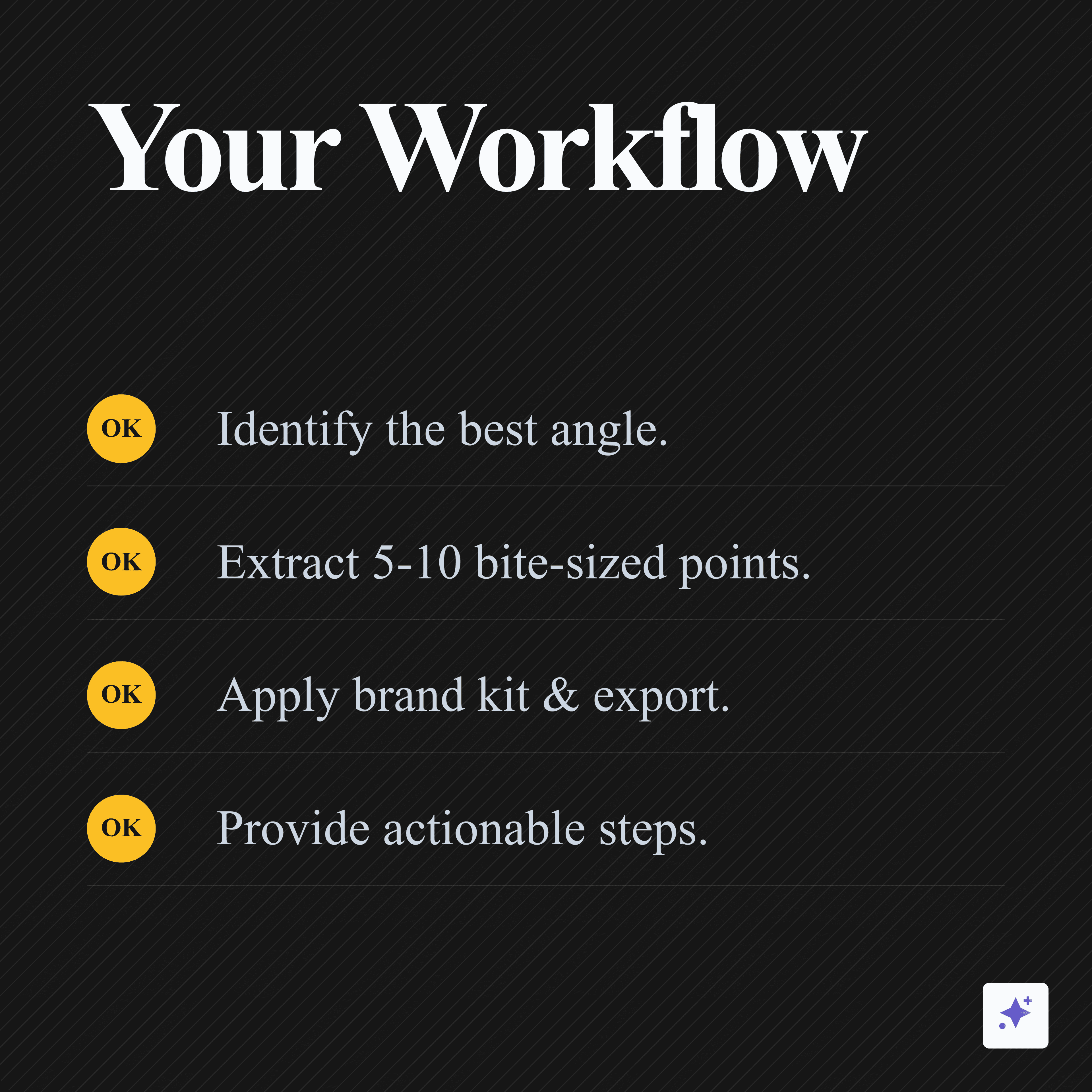
Use Highlightly for extraction, then adapt for Instagram
Highlightly is strongest at the source-to-asset step: paste the blog URL, review extracted hooks and key points, choose a carousel structure, apply your Brand Kit, and export the slides. Then use editorial judgment to make the Instagram version lighter than the LinkedIn version.
Make the carousel
Turn one blog angle into a saveable visual explainer.
Paste the blog into Highlightly, pull the strongest five to ten points, create the carousel, and adapt the slide density for Instagram.
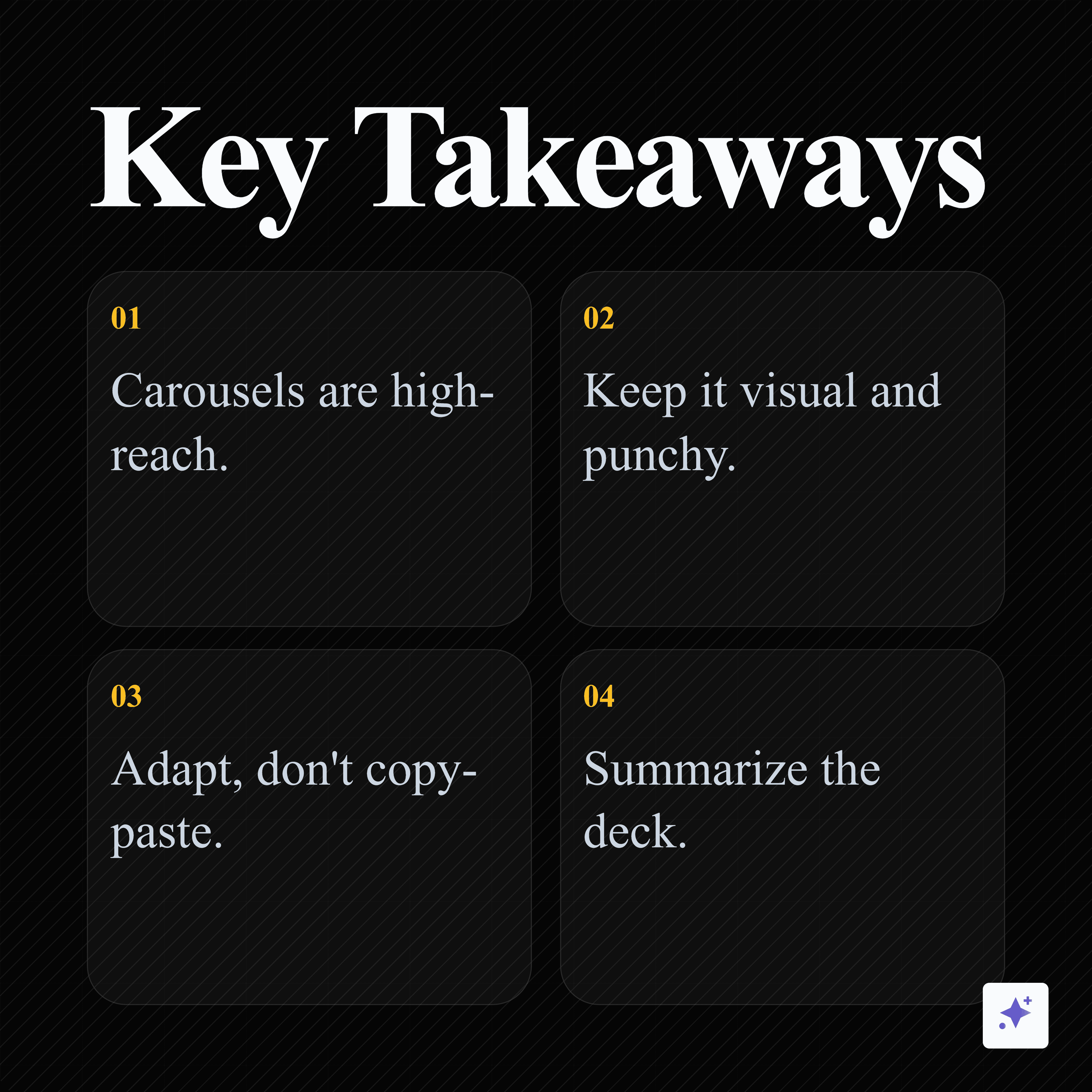
Start from a blogA blog becomes an Instagram carousel when you translate, not shrink.
Choose one angle, reduce the text, make every slide instantly understandable, and keep the source close enough for the asset to feel credible.
- Extract one clear angle.
- Use 5-10 fast slides.
- Write a caption that adds context.
Frequently asked questions
Research sources