


A report can have dozens of useful numbers, but a strong stat card usually has one job: make one number clear enough to stop the scroll and credible enough to trust.
The mistake is treating a stat card like a poster for the biggest number. The better workflow is to extract the number, preserve the context, and design the card around what the number actually means.
Extraction
Start with one statistic that has a clear takeaway
Look for numbers that change a reader's understanding: a percentage, comparison, growth rate, survey result, benchmark, cost, time saving, or trend. Then read the sentences around it before you design anything.
A good stat card candidate has
- One number readers can recognize quickly.
- A clear explanation of what the number measures.
- A credible source, report title, or organization.
- Enough context to avoid a misleading interpretation.
- A reason your audience should care.
The number is not the whole claim.
A percentage without sample, source, time period, or audience can mislead. If those details matter, include them in the source line, caption, or a follow-up slide.
Design
Make the number the hero, then explain it
The strongest stat cards have a clear visual hierarchy: number, meaning, source. If the reader only sees the number, the card may get attention but lose trust.
Article-specific examples
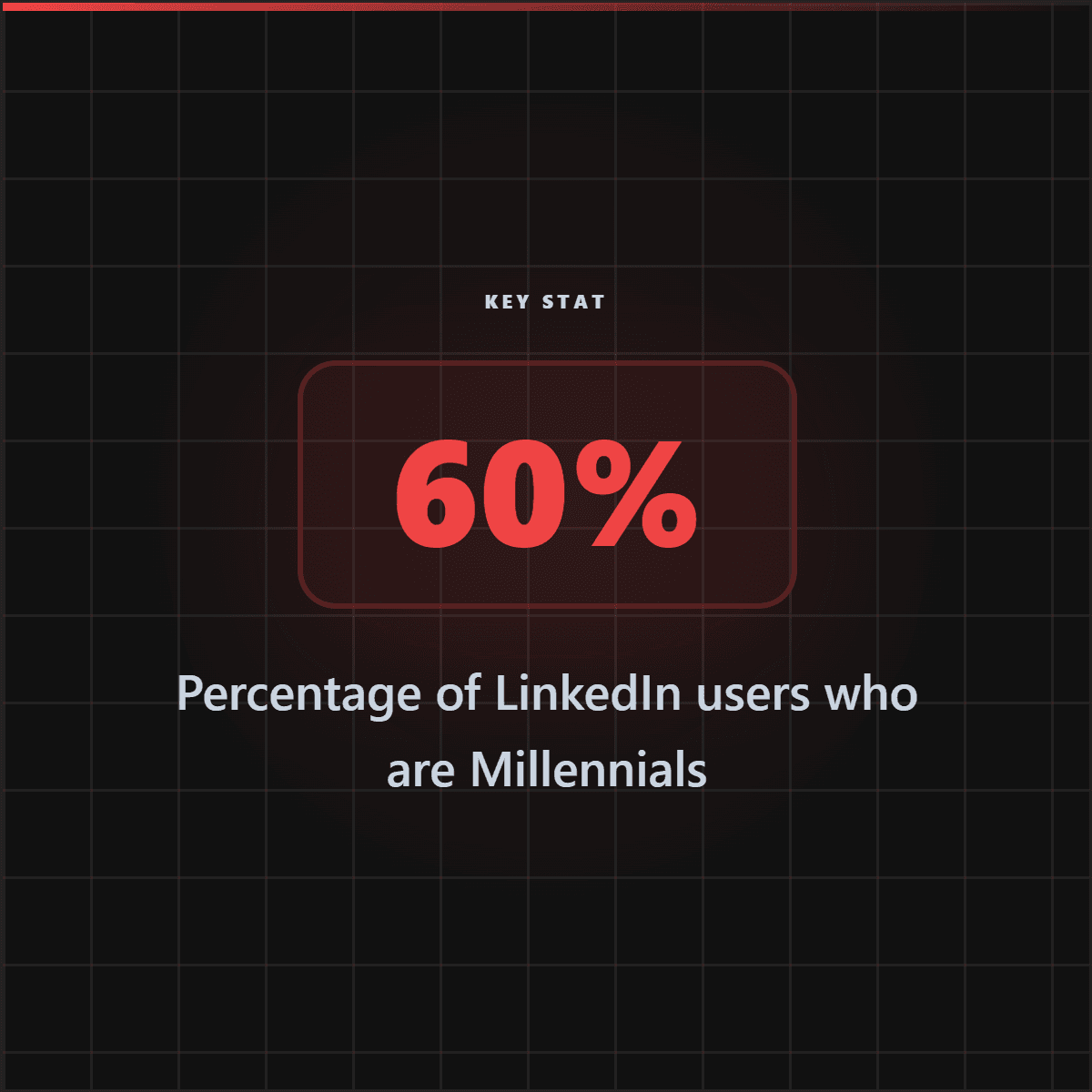
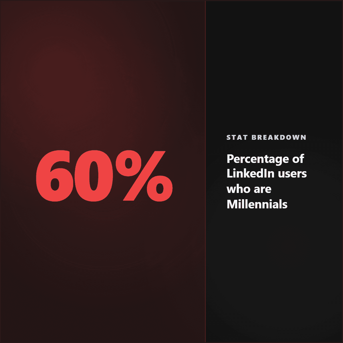
Stat card examples generated for this report workflow.
These Highlightly-generated stat card examples show why the best data graphics lead with one number, explain what it means, and keep attribution visible.
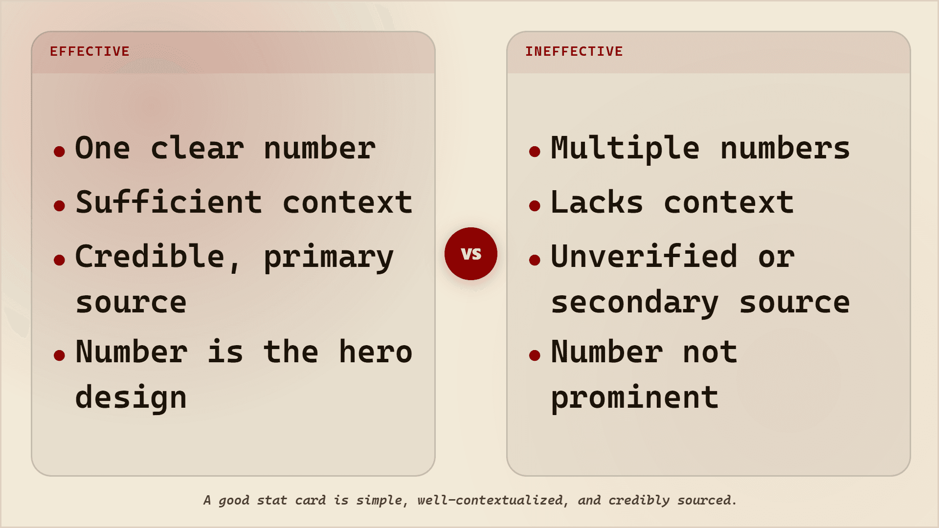


Effective vs ineffective stat cards
Workflow
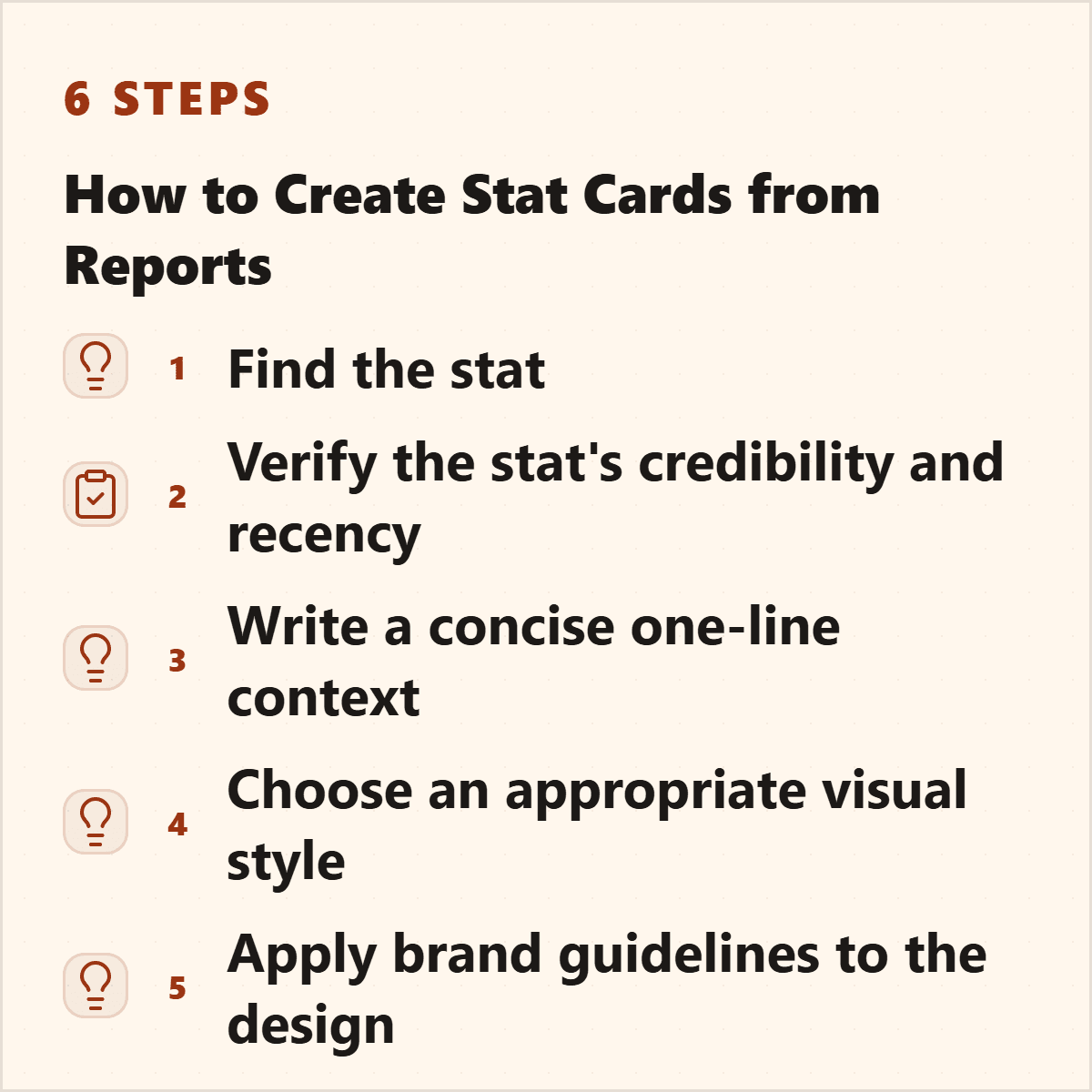
Turn a report into several proof assets
Report to stat card workflow
Extract candidate stats
Pull numbers, percentages, comparisons, and benchmarks from the report.
Read the surrounding context
Check what the number applies to and whether there are caveats.
Choose the format
Use a single stat card for one number, a comparison card for two numbers, and a carousel for a sequence of findings.
Add attribution
Show the source and keep important context close to the visual.
Write the caption
Explain why the stat matters to your audience and link back to the source when appropriate.
Tooling
Where Highlightly fits
Manual report stat cards vs Highlightly
Create a stat card
Turn one report statistic into a sourced social graphic.
Use Highlightly to extract statistics, choose the strongest number, apply your brand, and export a card readers can understand quickly.
Make a stat cardThe best stat cards are simple, contextual, and sourced.
The design should make the number easier to understand while keeping the evidence trail intact.
- Lead with one number.
- Explain what it means.
- Show where it came from.
Frequently asked questions
Research sources