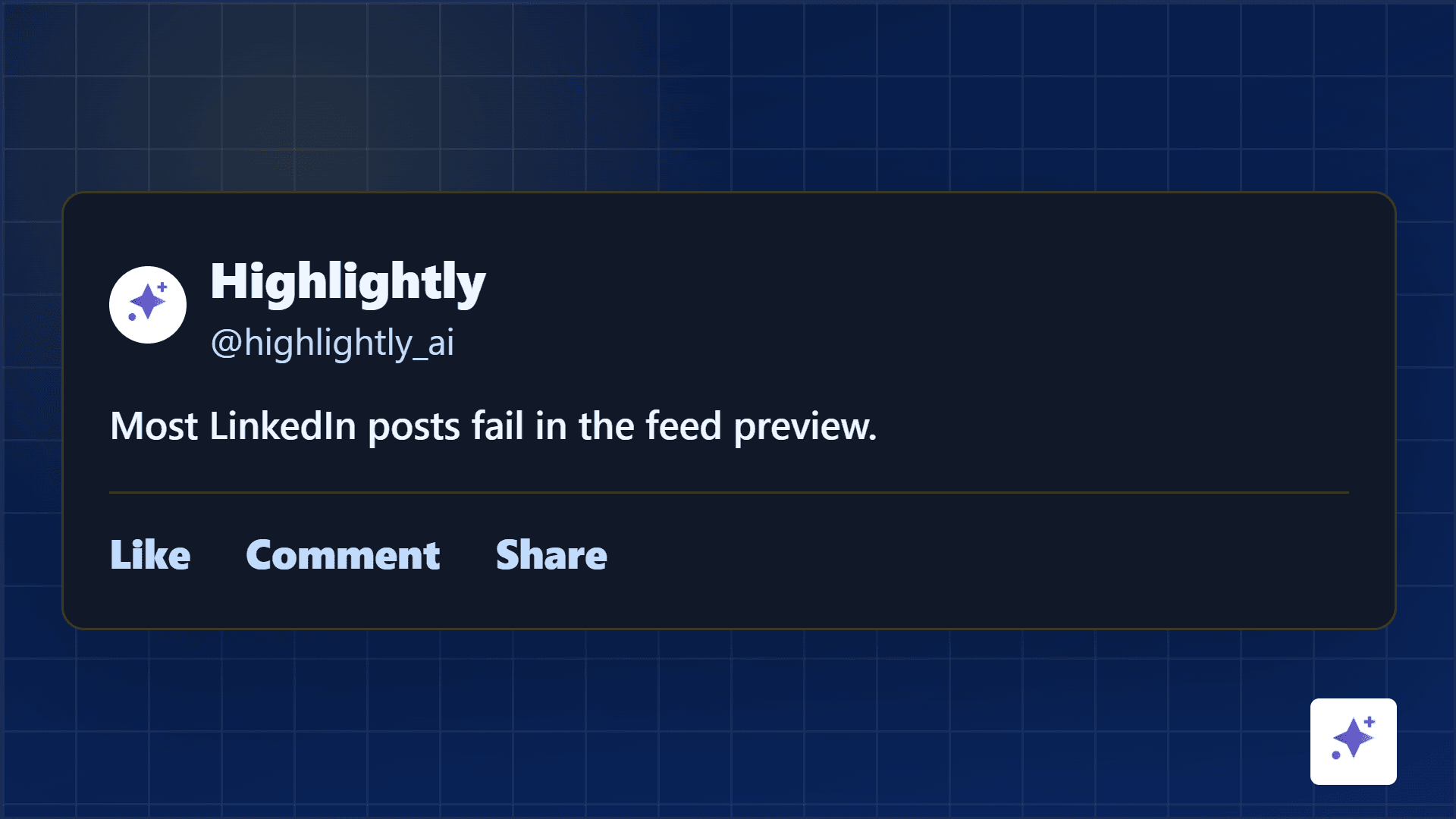
A LinkedIn post can be well written and still lose in the feed preview.
That is the part most people miss. The reader does not start with your full argument. They start with a small preview: your name, the first lines, maybe a visual, and a split-second judgment about whether this is worth effort.
Core frame
Win the preview before you ask for the read
LinkedIn readability starts above the fold. The first two lines should make the rest feel necessary. The attached image or carousel should make the promise feel concrete. If both are vague, the post rarely gets a chance.
Your caption and visual are two hooks, not separate assets.
The first two lines create curiosity. The image, quote card, stat card, screenshot, or carousel cover proves there is something worth opening.
First lines
Write the first two lines like a headline
A good LinkedIn opening is specific enough to stop a reader and incomplete enough to earn the click. It should not explain everything. It should make the reader want the next line.
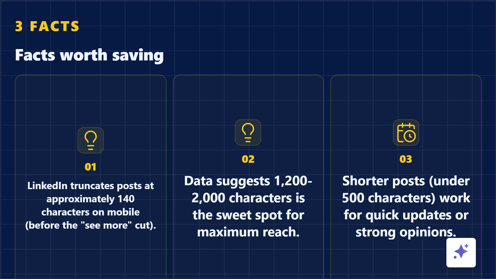
First-line formulas that work
- Specific pain: Most B2B case studies hide the only useful part.
- Surprising result: This one screenshot changed our pricing page.
- Contrarian claim: Your carousel is not too short. It is too vague.
- Proof-led opening: We turned one report into nine sourced posts.
- Open loop: The mistake was not the copy. It was the preview.
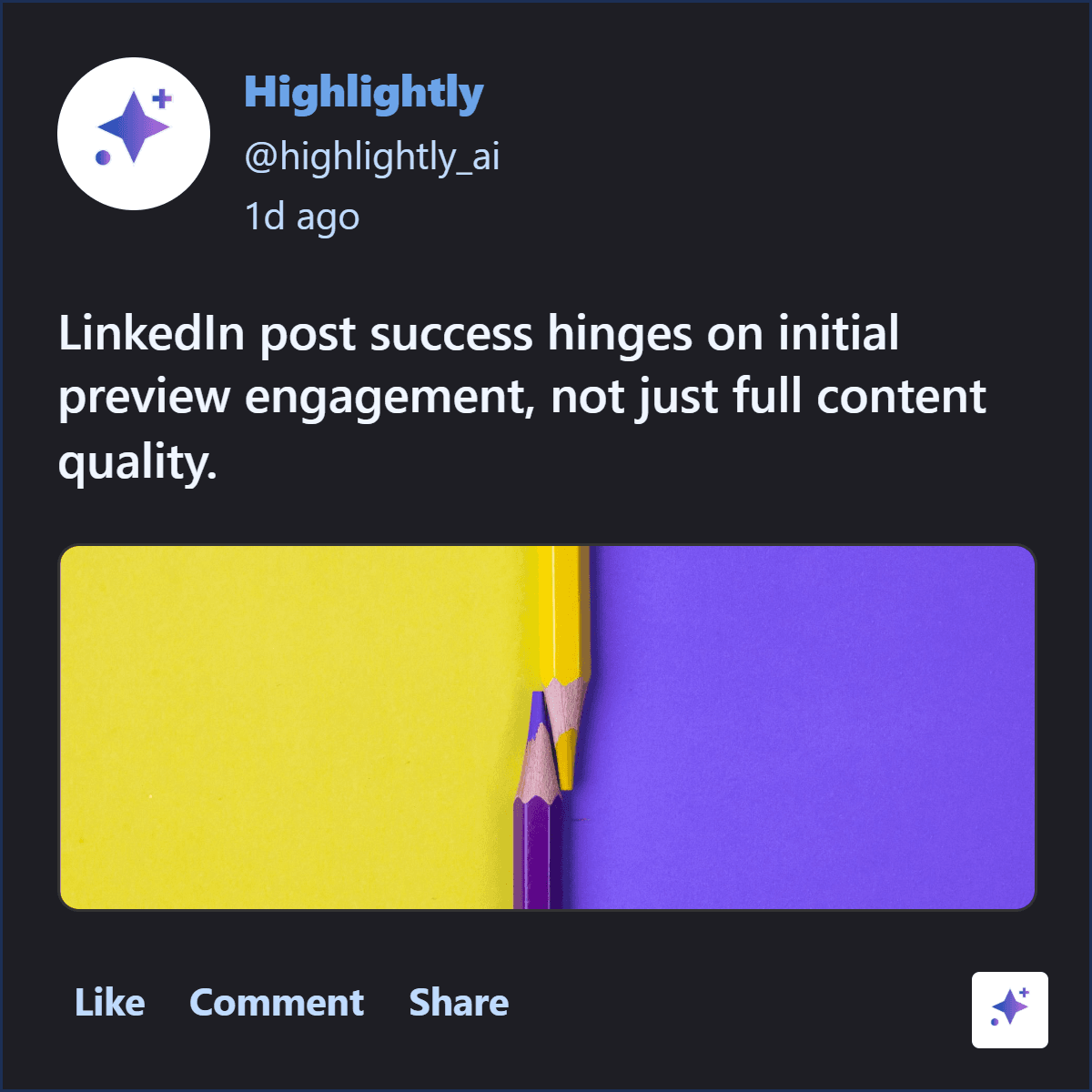
Feed preview
Make the first lines and the visual work together.
These examples show the preview system: a caption hook plus a visual proof asset that makes the rest of the post feel worth opening.
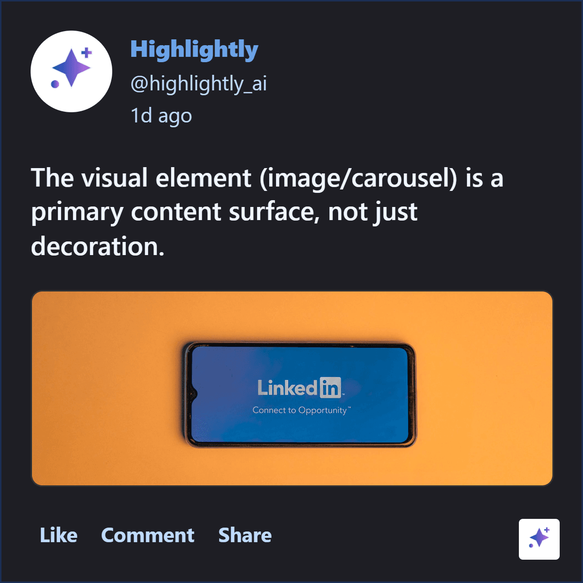
Visual hook
The attached image has to carry its own promise
The visual is not a decoration after the writing. It is another preview surface. A quote card should reveal the strongest sentence. A stat card should make the number obvious. A screenshot should tell the viewer exactly what to notice. A carousel cover should promise a transformation, mistake, framework, or result.
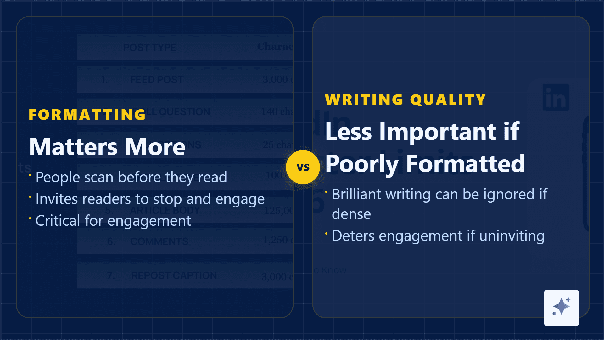
Generic visuals vs source-backed visuals
Visual proof examples
Use graphics when they give the post a reason to stop.
A quote card, stat card, or image mockup should carry a real claim from the source, not just make the post look busy.
Rhythm
Format the body for scanning
Readable LinkedIn posts use short paragraphs, clean transitions, and enough breathing room. One sentence can be a paragraph. A blank line is not laziness. It is a signal that the next idea is easy to enter.
LinkedIn readability checklist
Framework
Use hook, visual, dwell, payoff
The structure
Hook
Use the first one or two lines to make the reader care.
Visual
Attach a source-backed card, screenshot, or carousel cover that proves the promise.
Dwell
Deliver the value in short paragraphs, bullets, or a simple story arc.
Payoff
End with a useful takeaway, question, save prompt, or next step.
Hashtags and links
Do not make discovery tools interrupt the read
Use a few relevant hashtags at the end if they help discovery. Avoid inline hashtag stuffing. If you need a link, place it where it does not break the opening rhythm and explain why the link is worth clicking.
Make the visual hook
Turn one claim into the proof asset attached to your post.
Use Highlightly to extract a quote, stat, screenshot, or carousel cover from your source, then write the first two LinkedIn lines around that proof.
Create a LinkedIn assetLinkedIn formatting is attention design.
Readable posts do not trick people into reading. They respect the feed preview, make the value visible, and let the reader move through the idea without friction.
- Optimize the first two lines.
- Make the visual prove the promise.
- Use spacing to carry the reader.
Frequently asked questions
Research sources