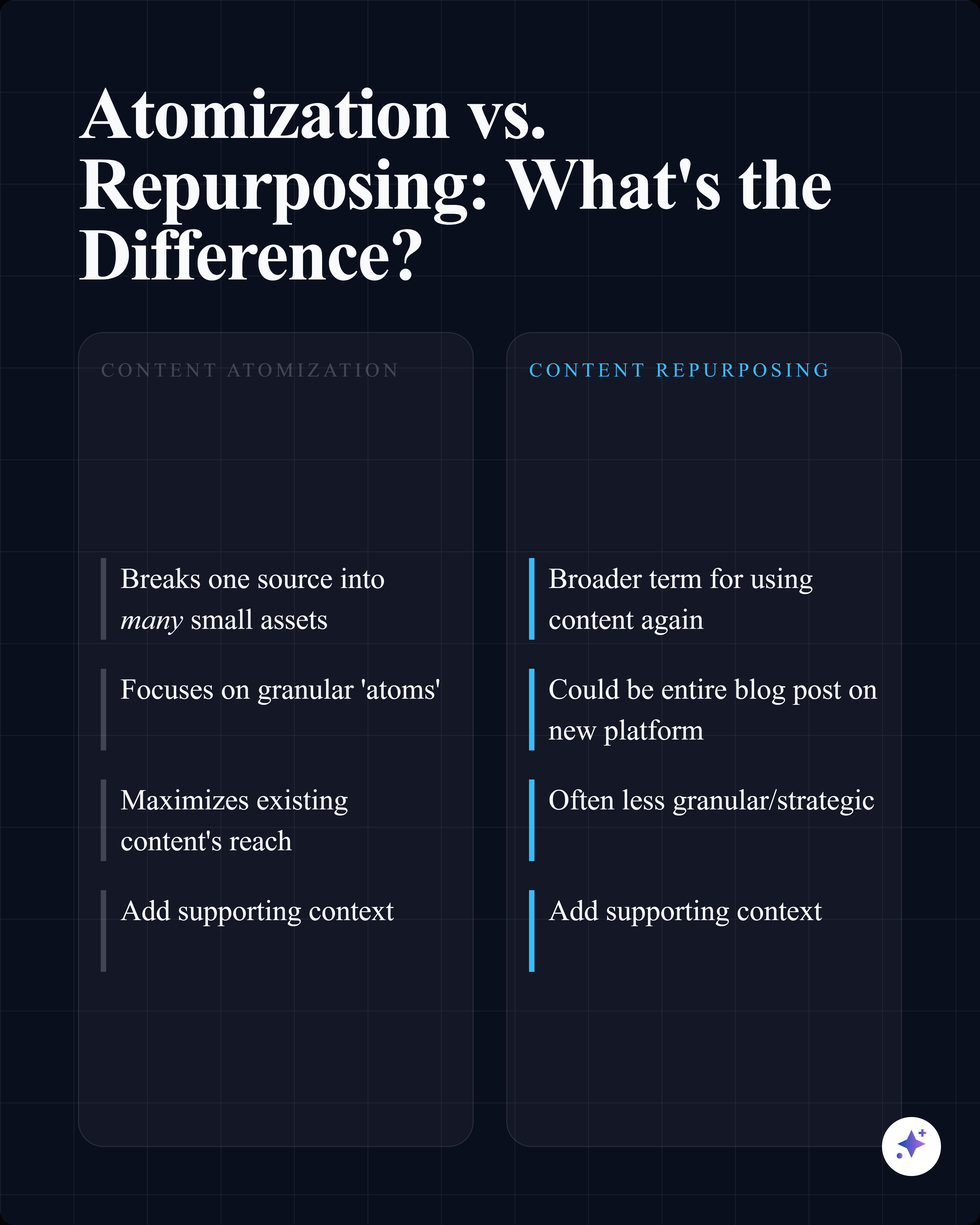
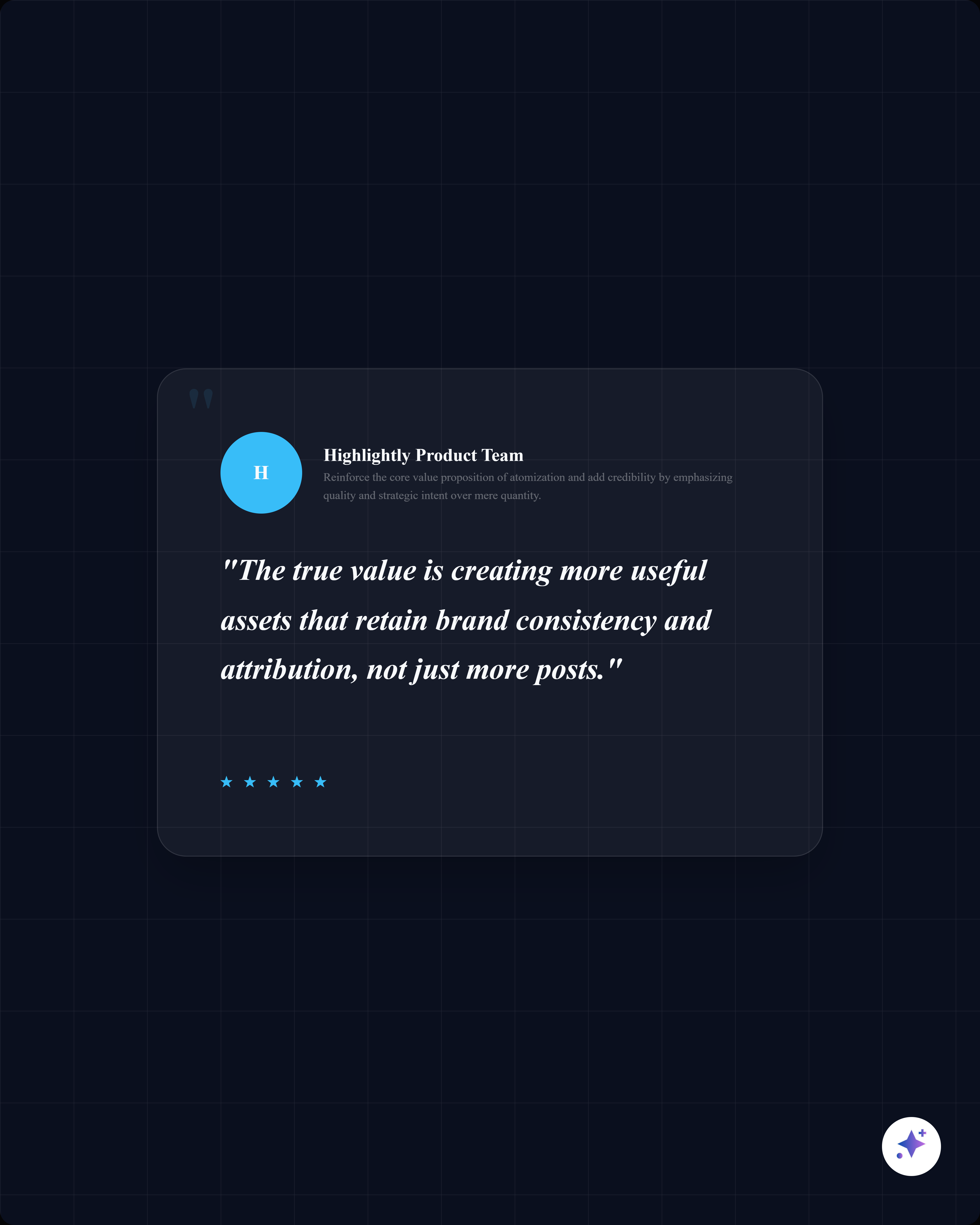
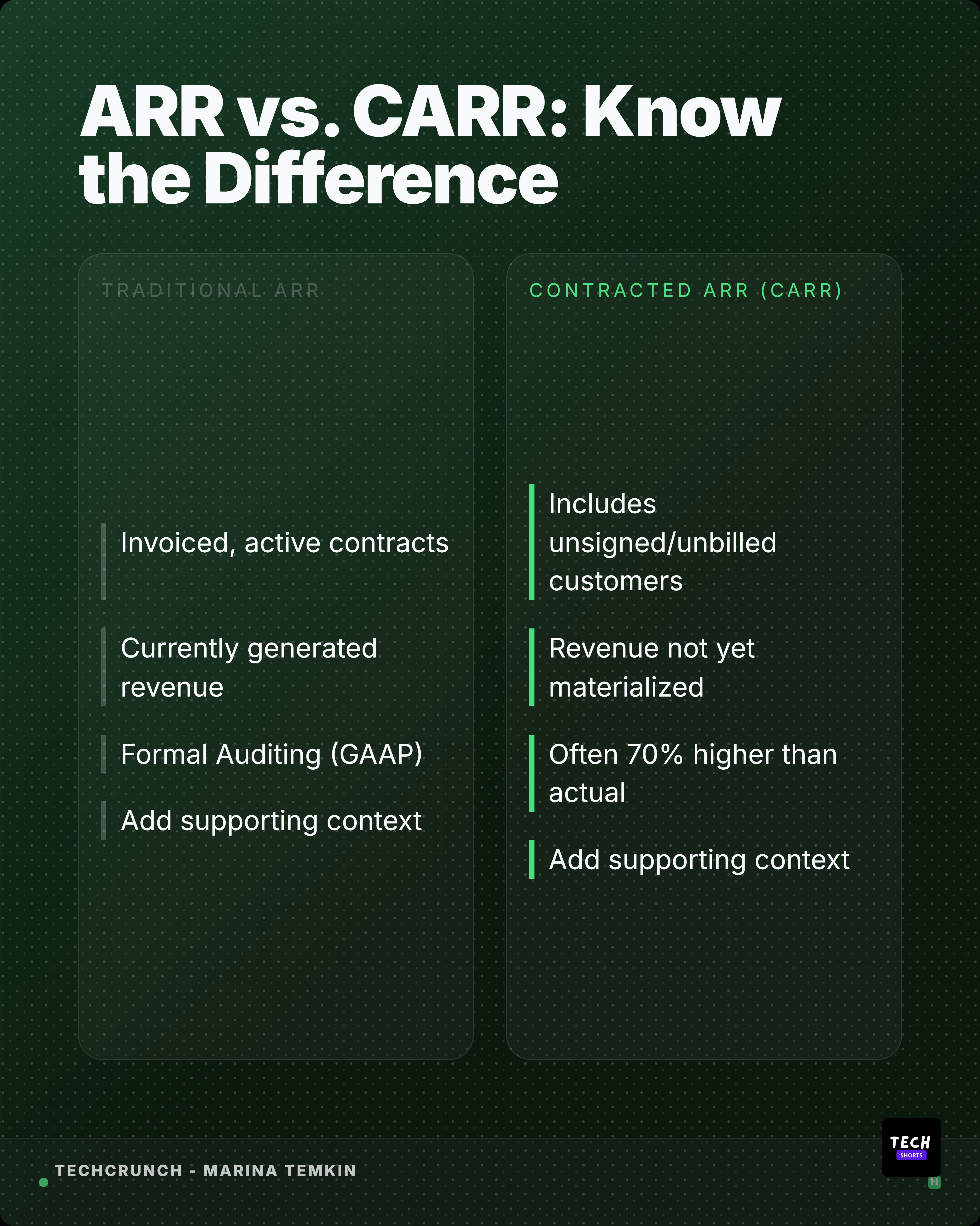
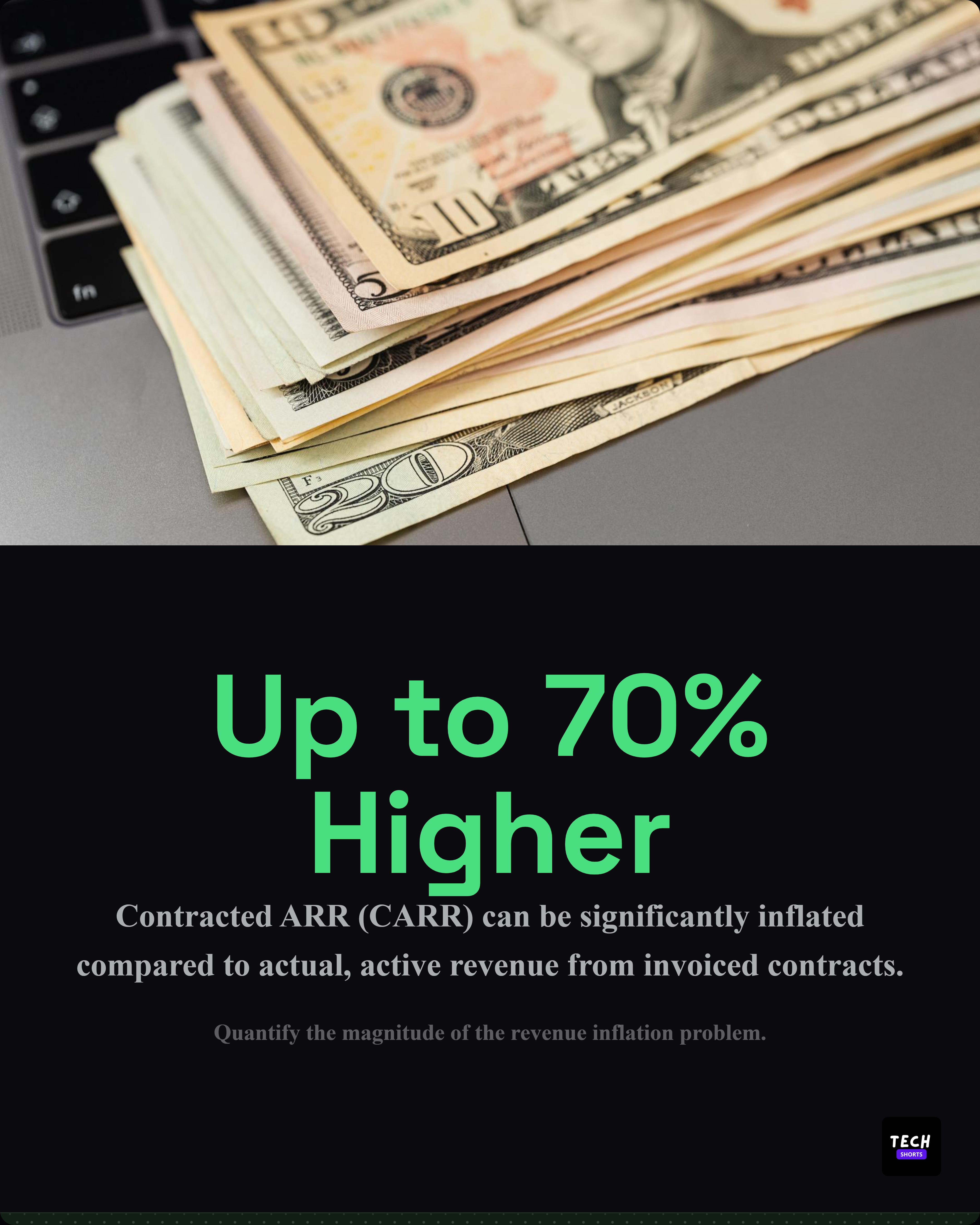
Free tool — no account required
Color Contrast Checker
Check foreground and background color contrast against WCAG 2.1 accessibility standards. Get instant pass/fail results and suggested fixes.
Colors
#
#
WCAG 2.1 Compliance
AA Normal Text
min 4.5:1PASS
AA Large Text
min 3:1PASS
AAA Normal Text
min 7:1PASS
AAA Large Text
min 4.5:1PASS
Accessible Presets
Contrast Ratio
17.06:1
Fully Accessible
Heading Text
This is how your body text will appear with the selected color combination. Good contrast ensures readability for all users.
Smaller text at 14px — harder to read with low contrast.
ButtonOutline
About WCAG 2.1
The Web Content Accessibility Guidelines define minimum contrast ratios. AA requires 4.5:1 for normal text and 3:1 for large text (18px+ bold or 24px+ regular). AAA requires 7:1 and 4.5:1 respectively.