Which LinkedIn post sizes and formats work best?
The best LinkedIn format depends on the job of the post. Use portrait or square images for single ideas, document posts for swipeable explanations, quote cards for a strong line, stat cards for proof, screenshots for product or evidence, and banners for profile context. Common working sizes include 1080x1350 for portrait feed posts, 1080x1080 for square posts and carousel slides, 1200x627 for link-style images, 1584x396 for profile banners, and 1128x376 for company covers.
The useful workflow is extraction first, packaging second: find the strongest source-backed material, decide what it proves, then turn it into the format people can actually read in-feed.
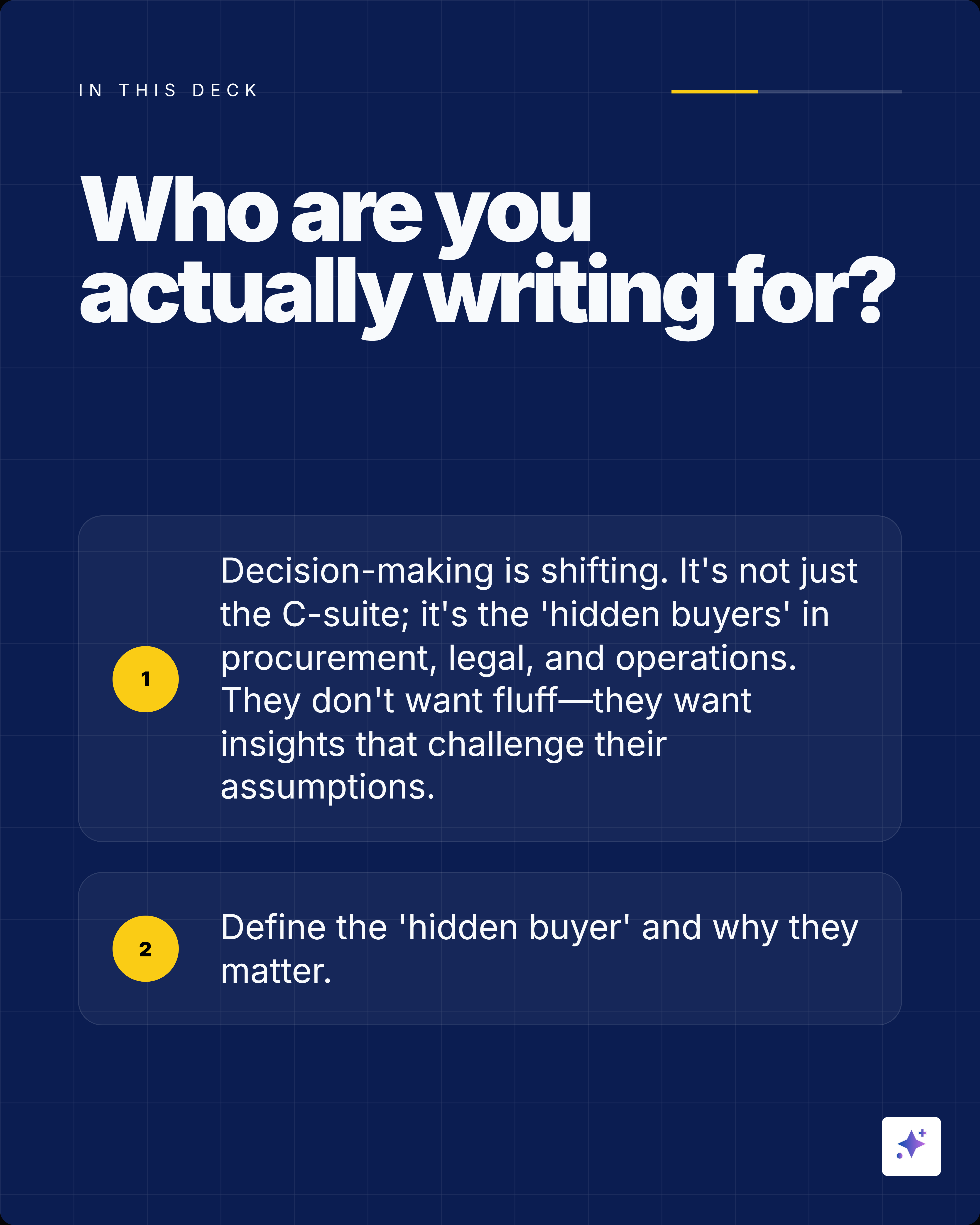
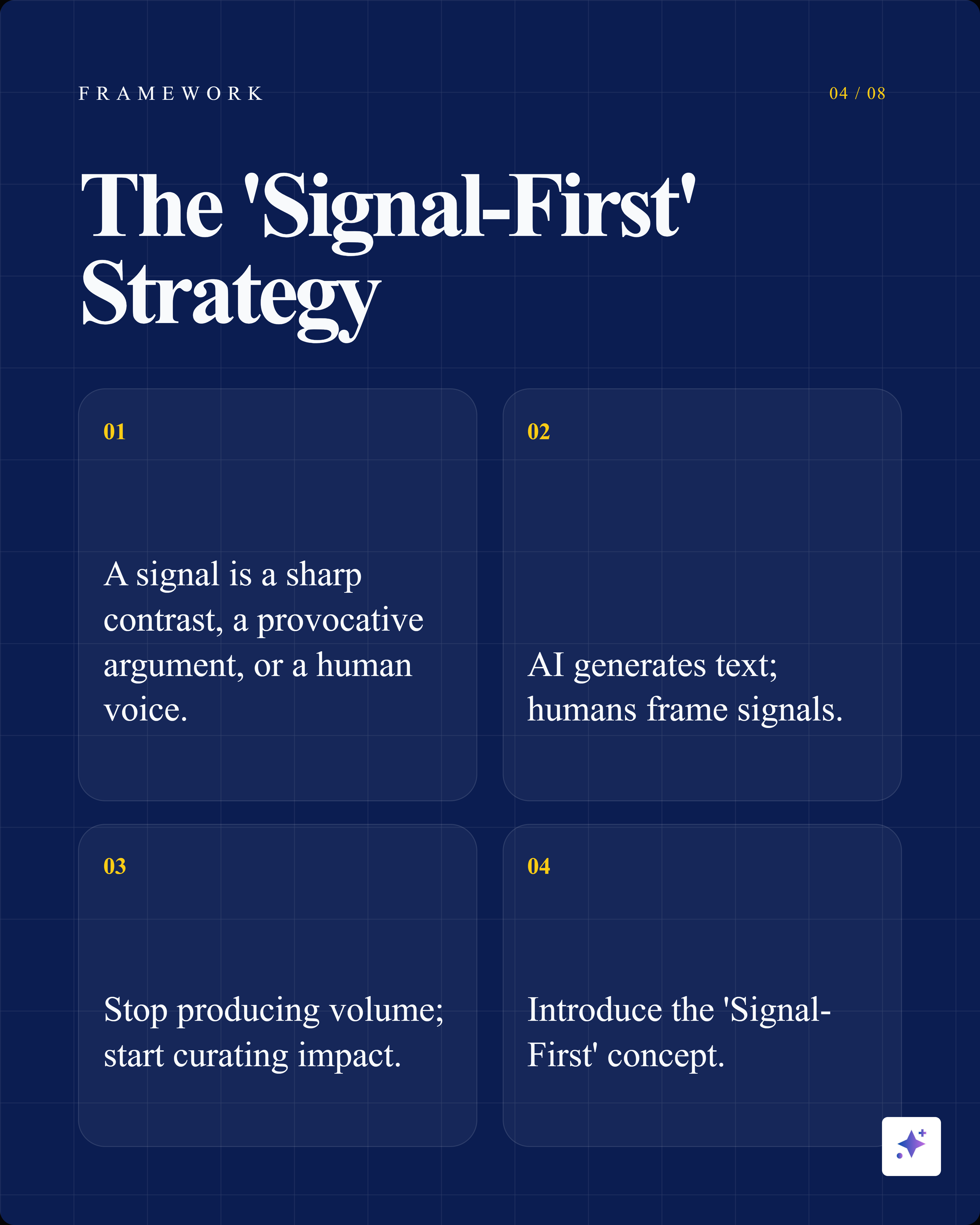
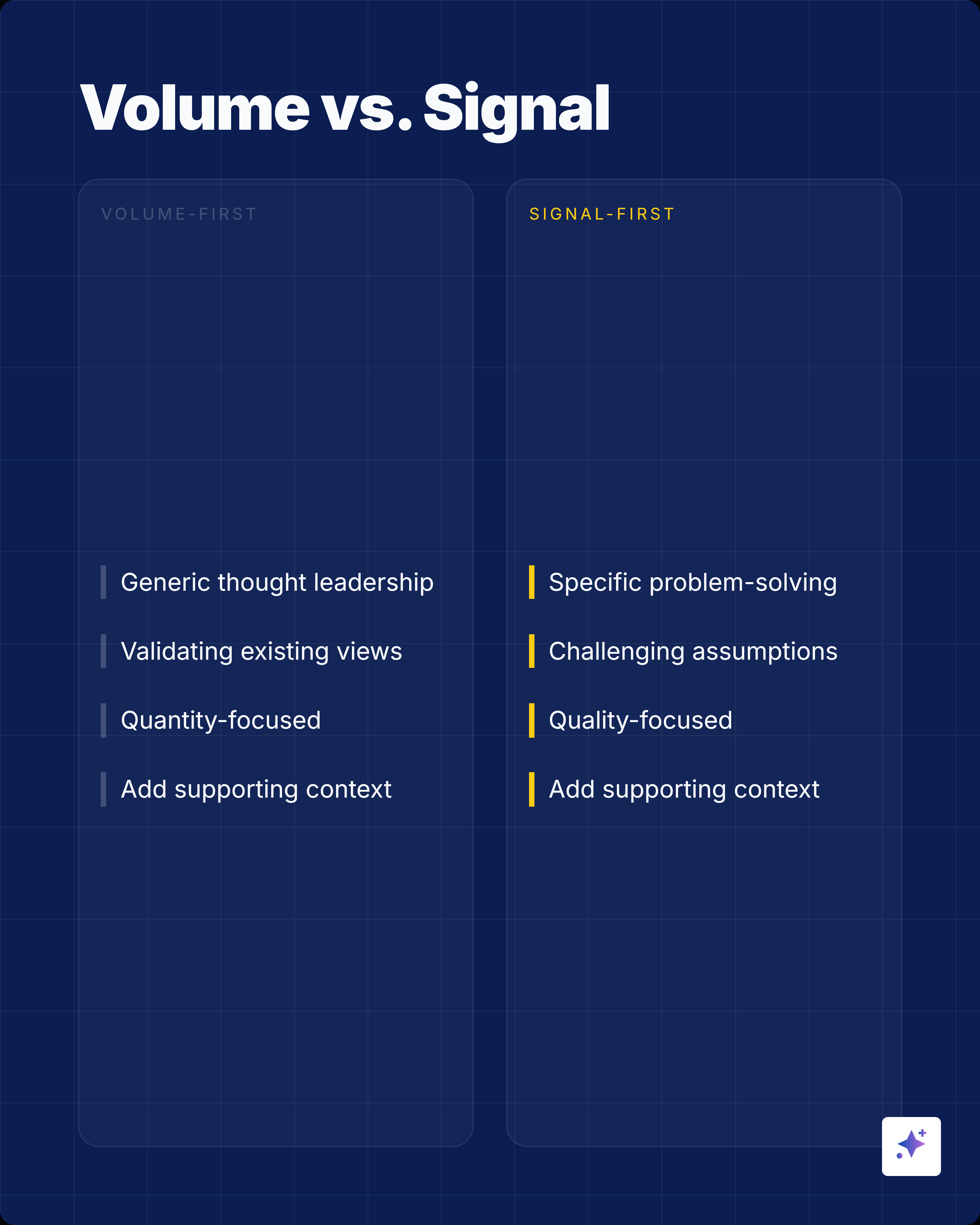
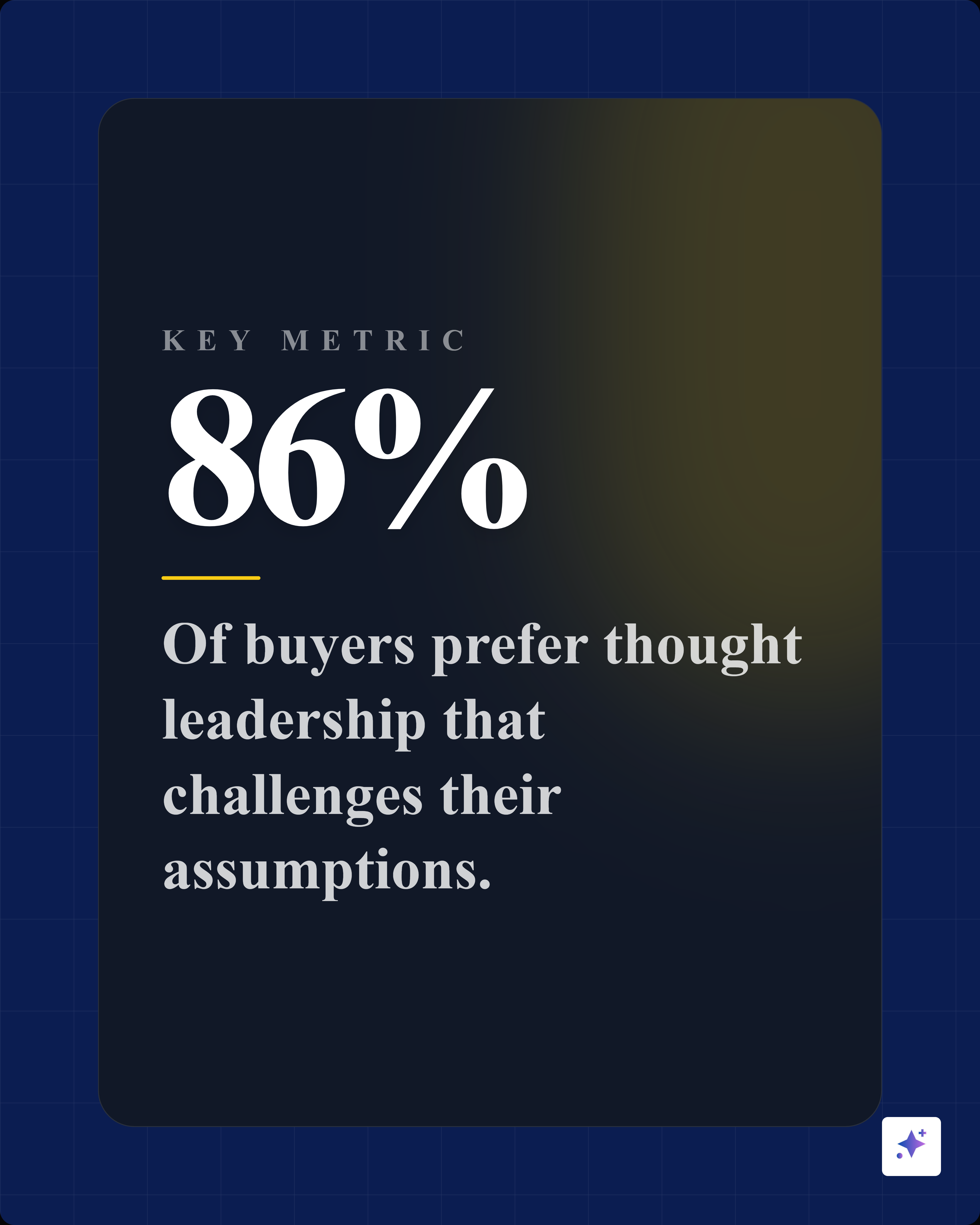
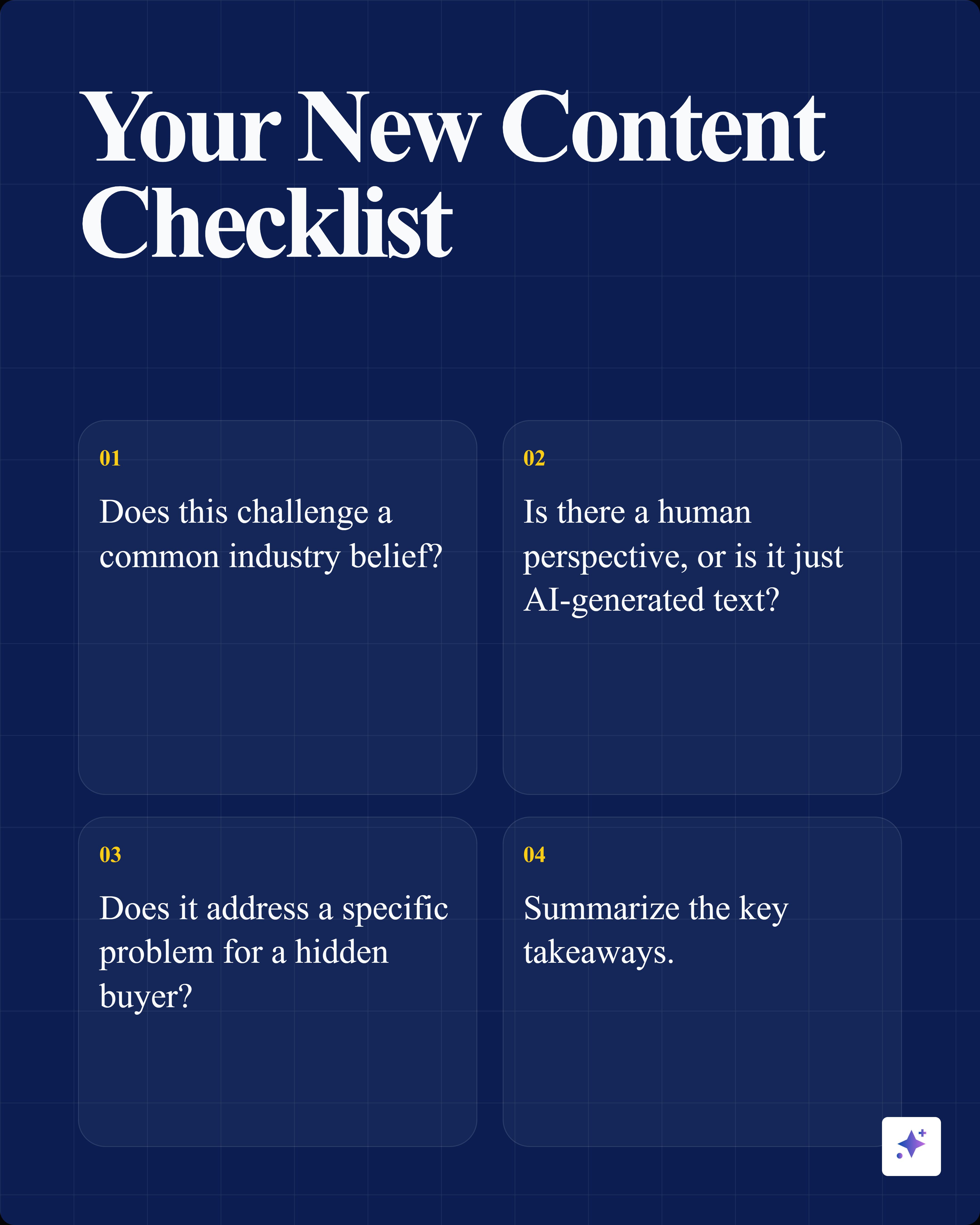
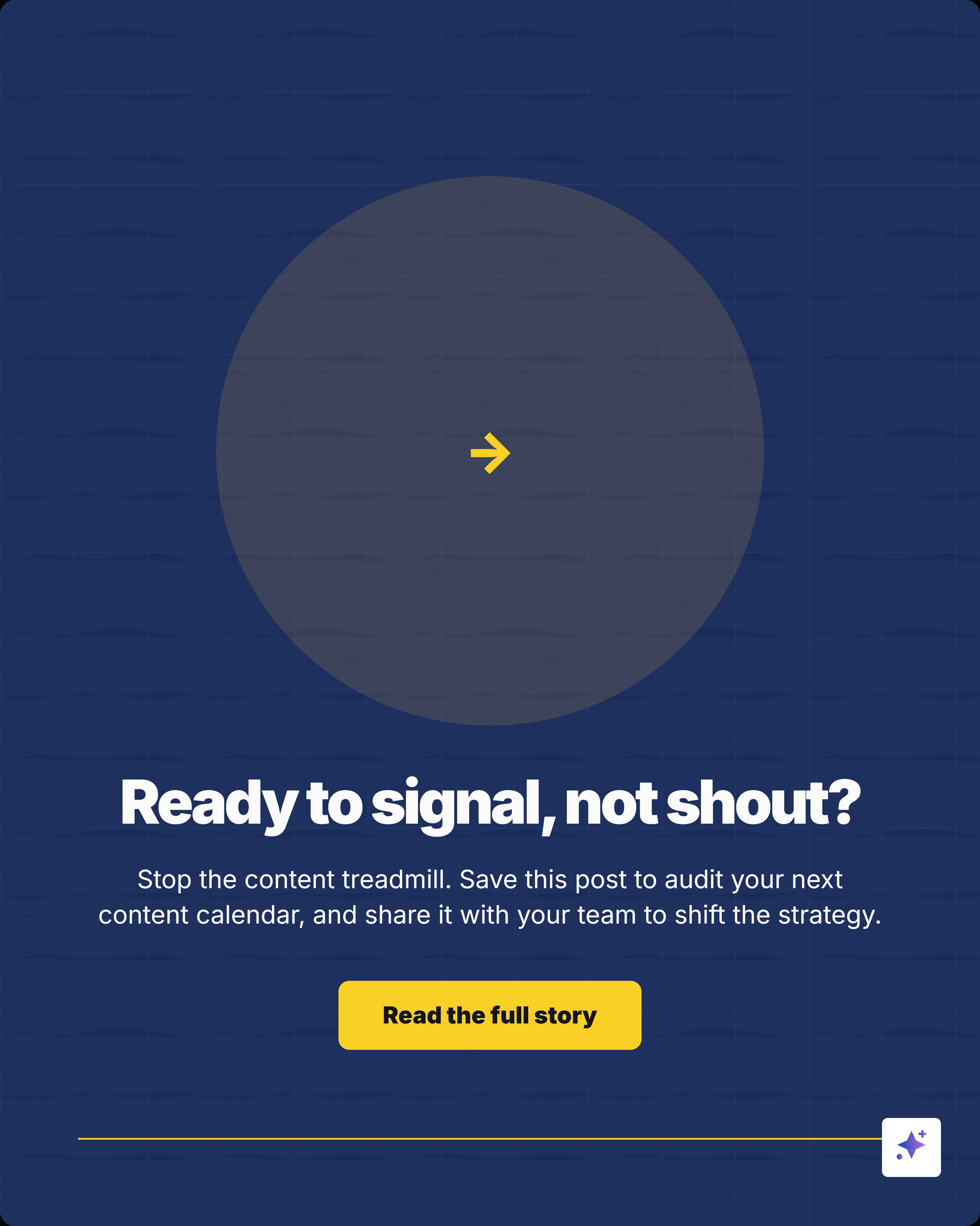
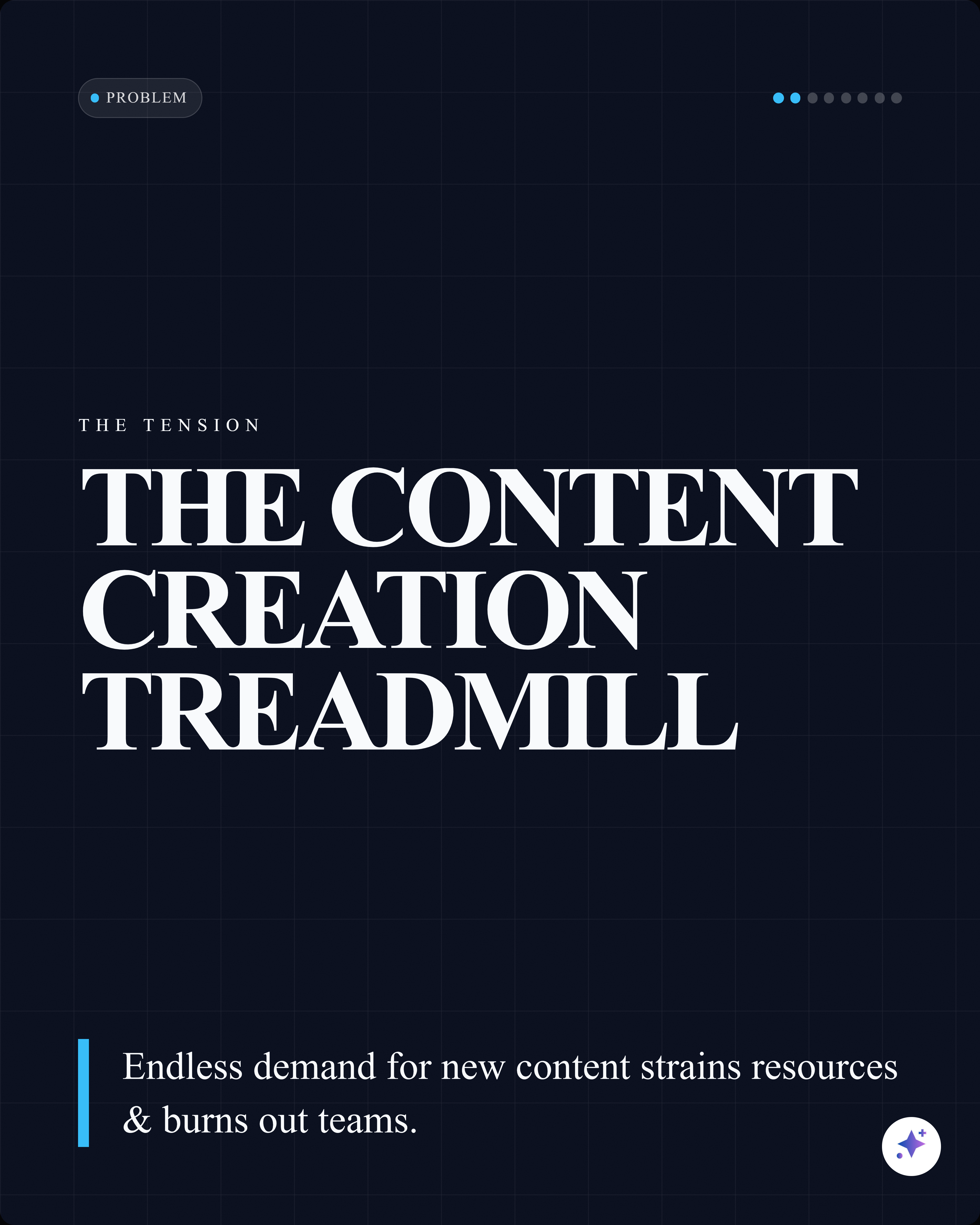
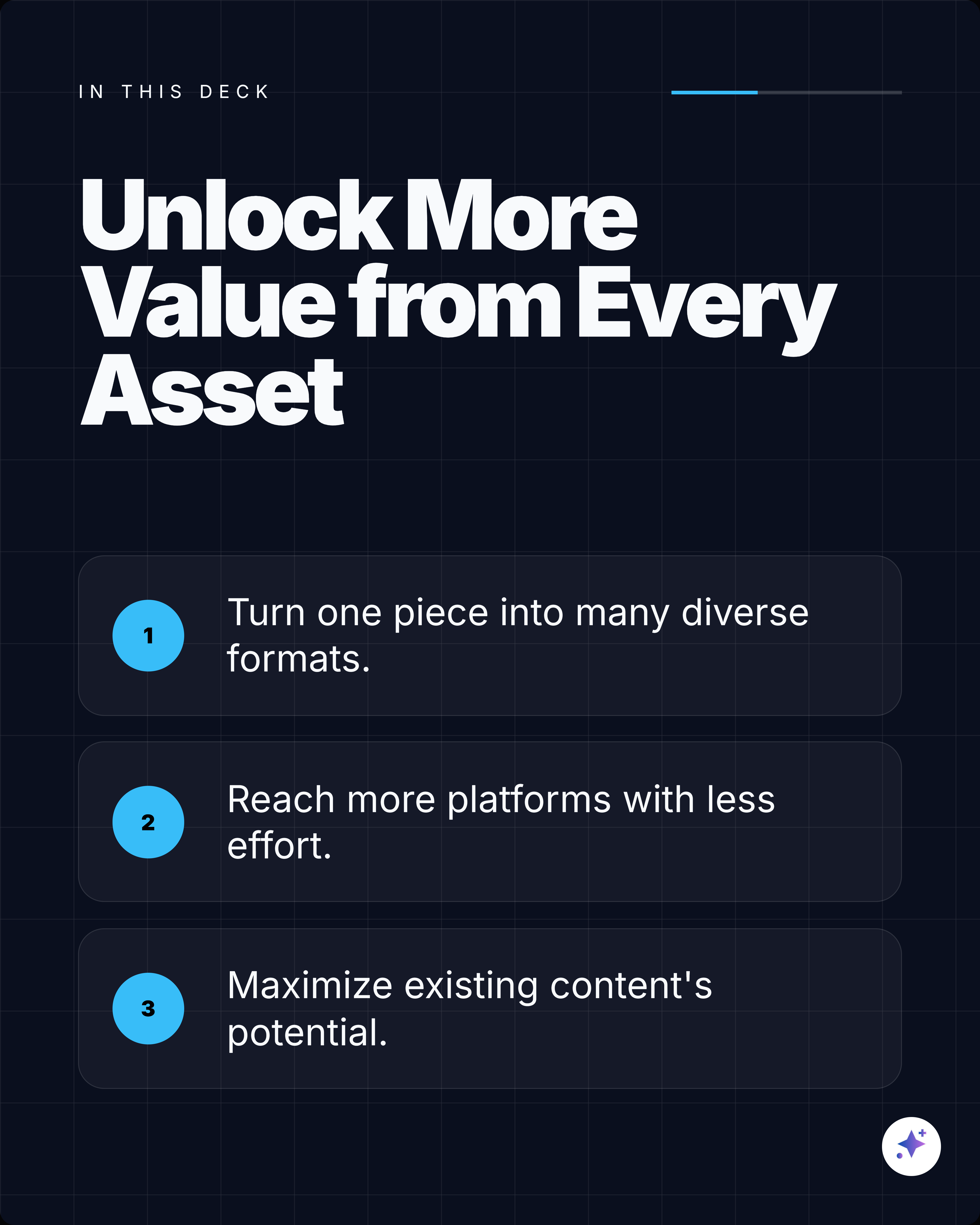
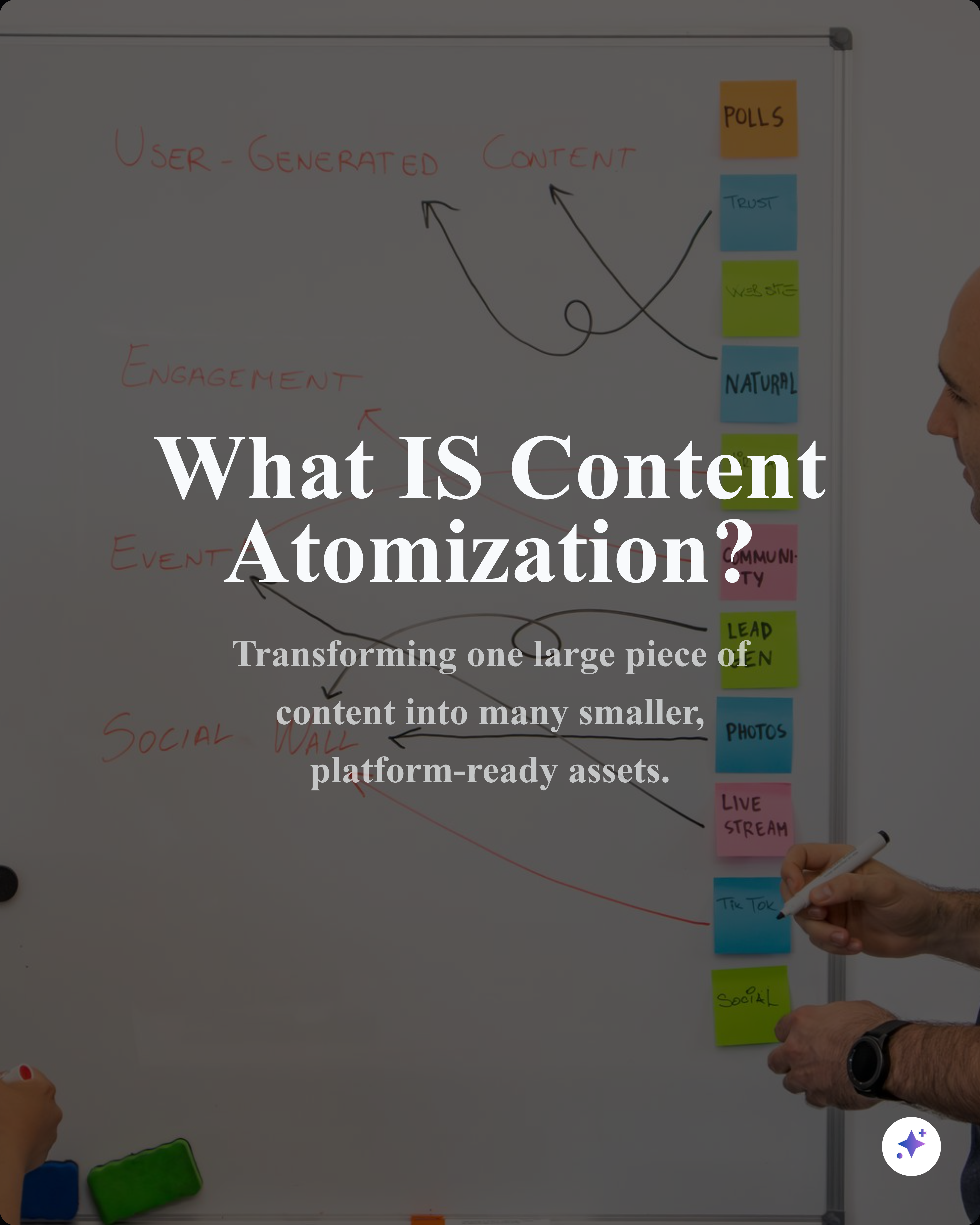
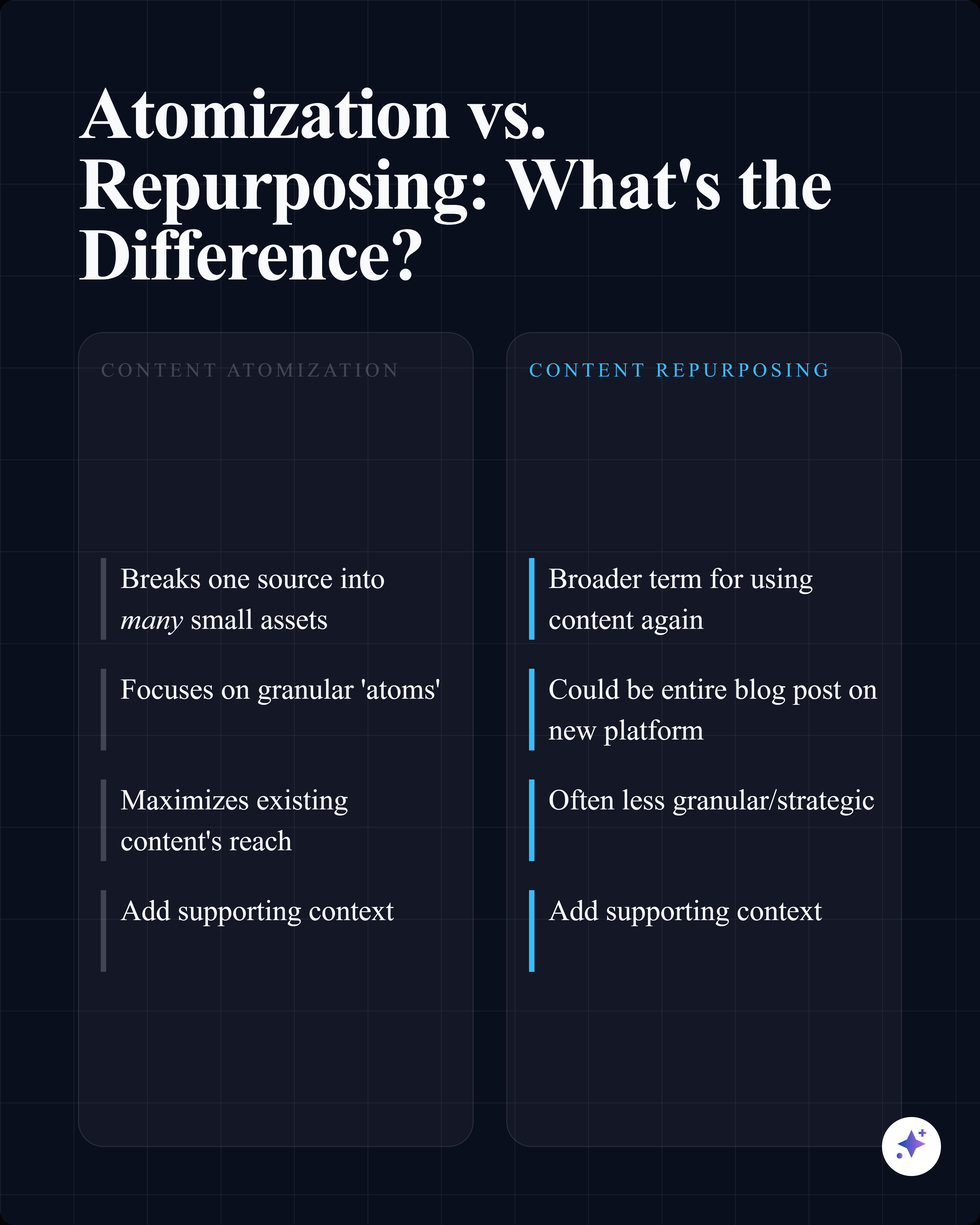
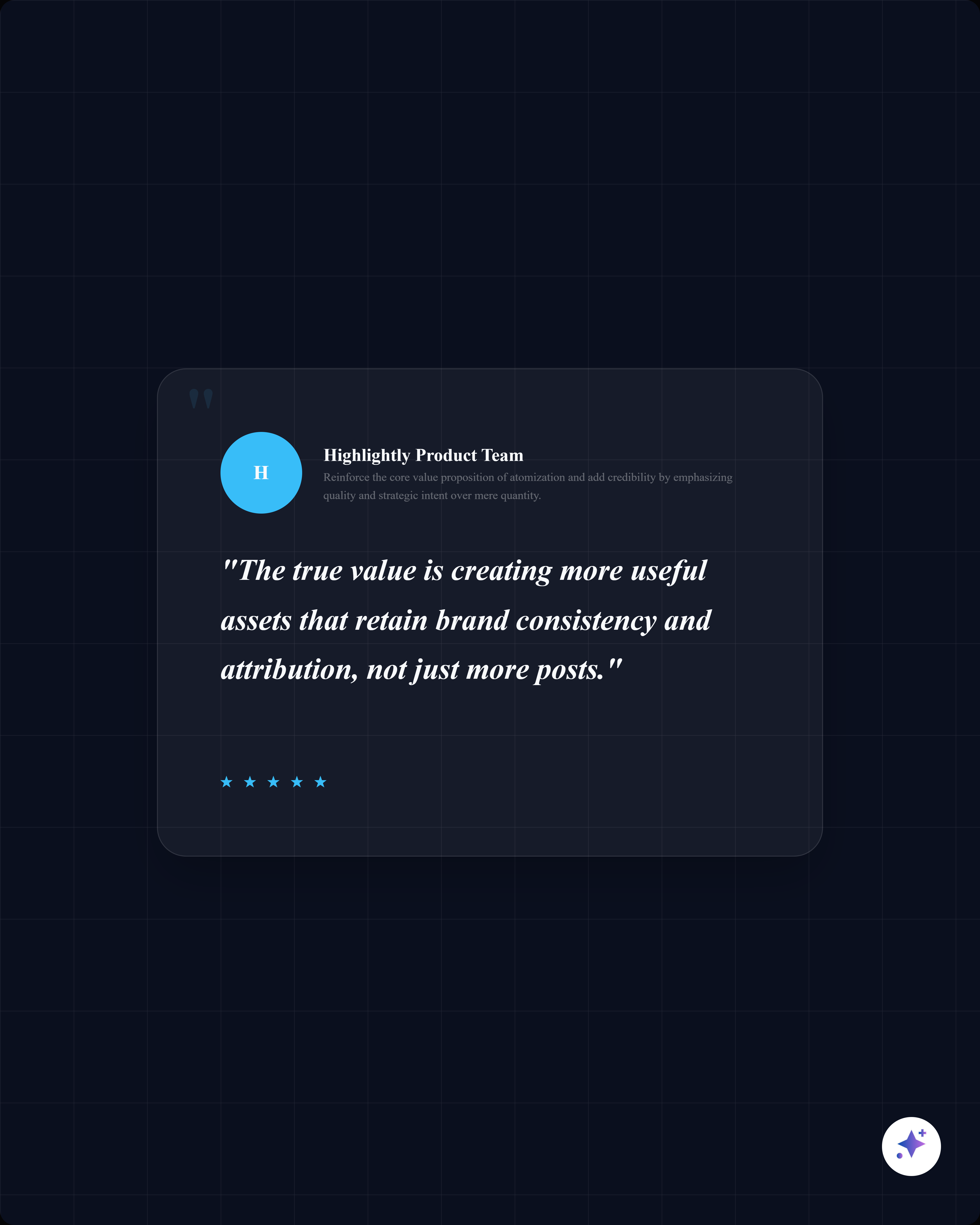
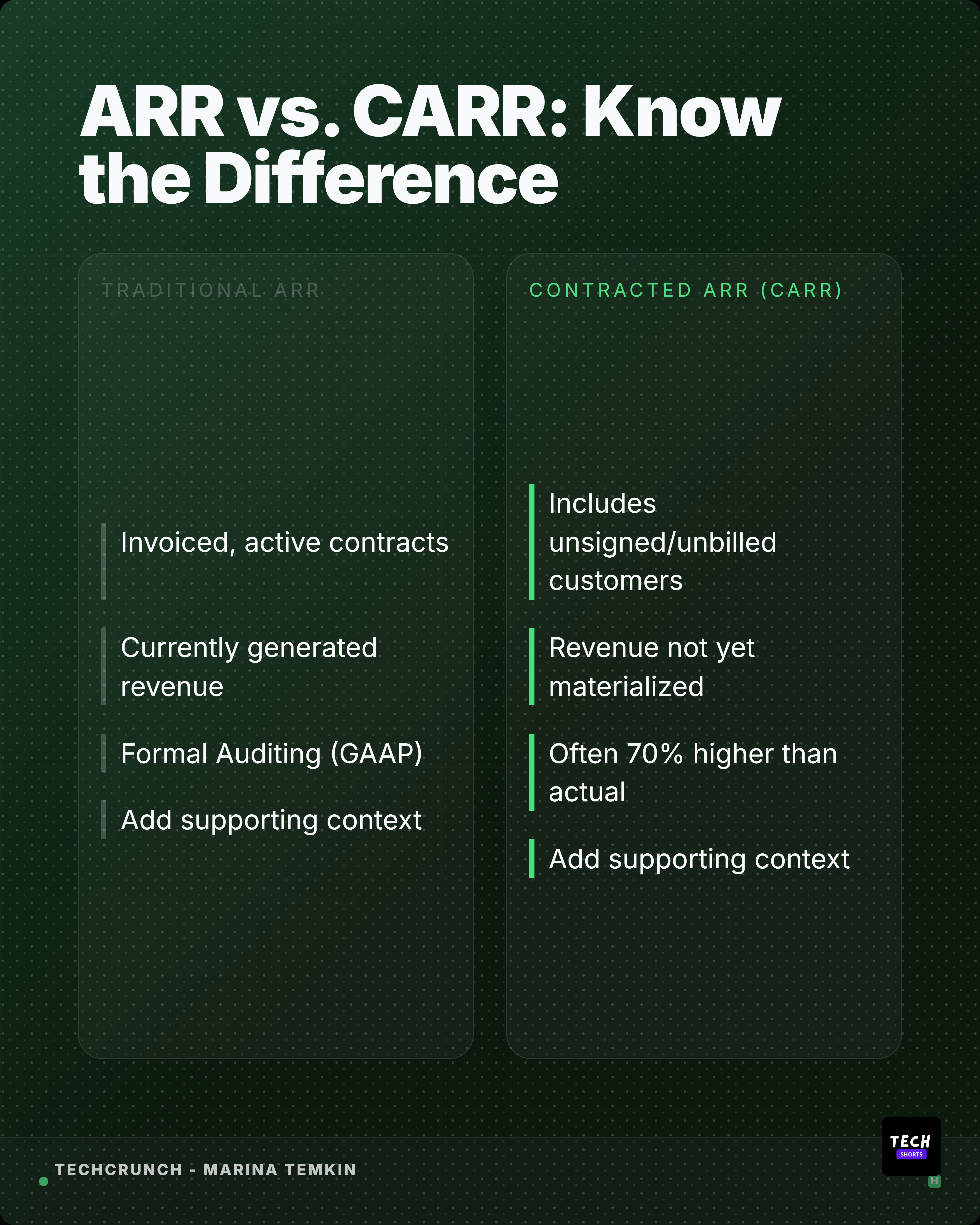
A source-backed carousel is a sequence, not a chopped-up summary.
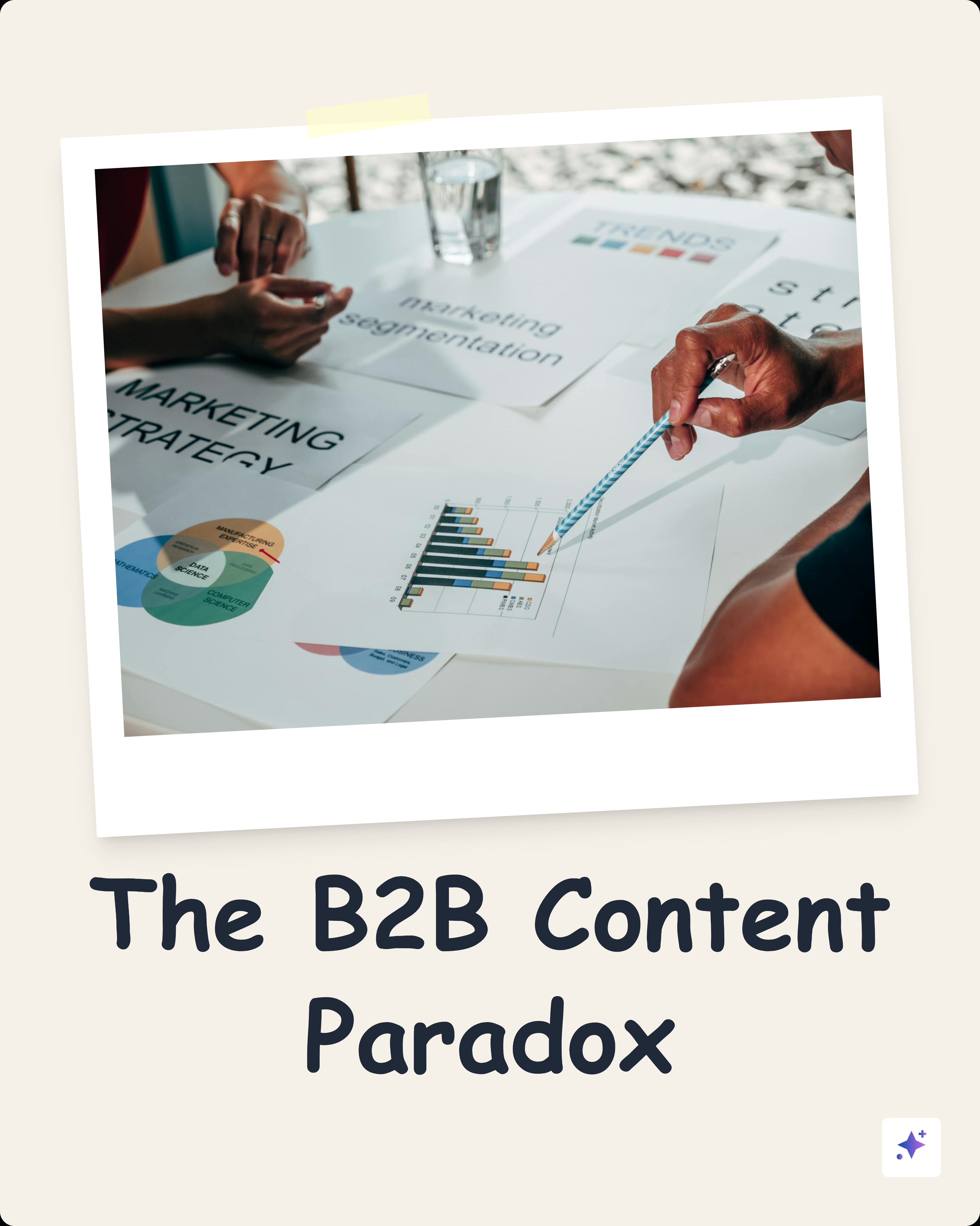
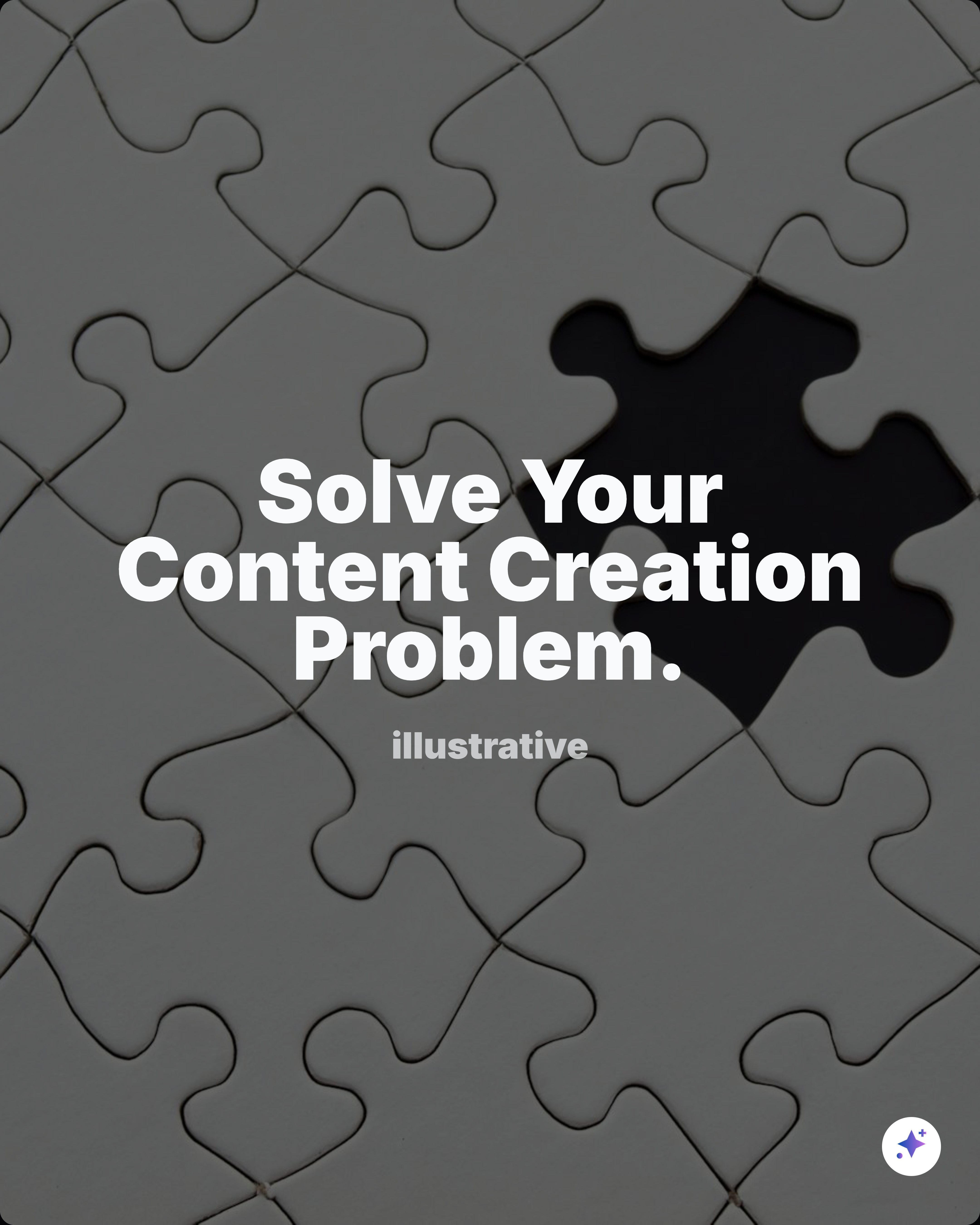
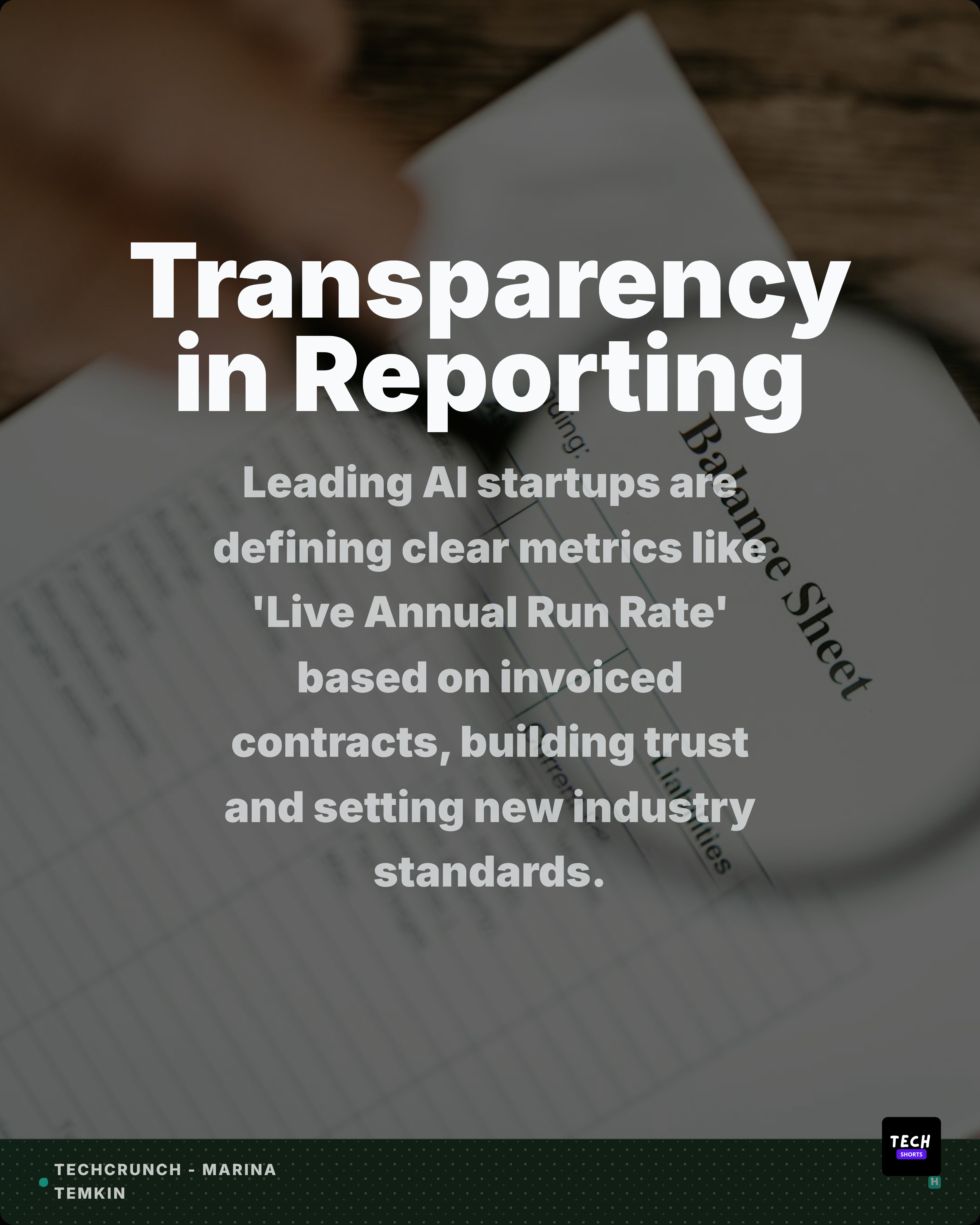
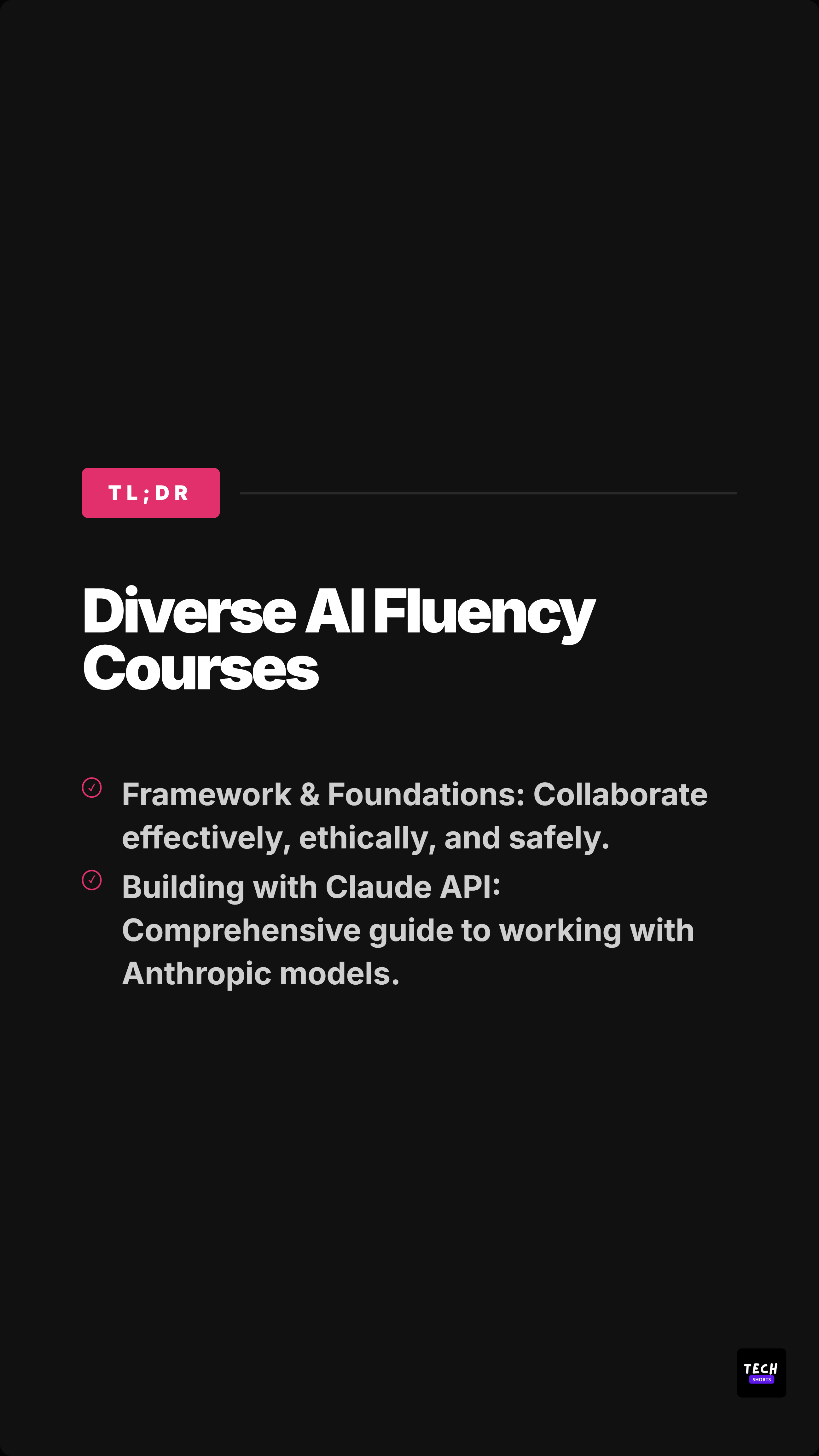
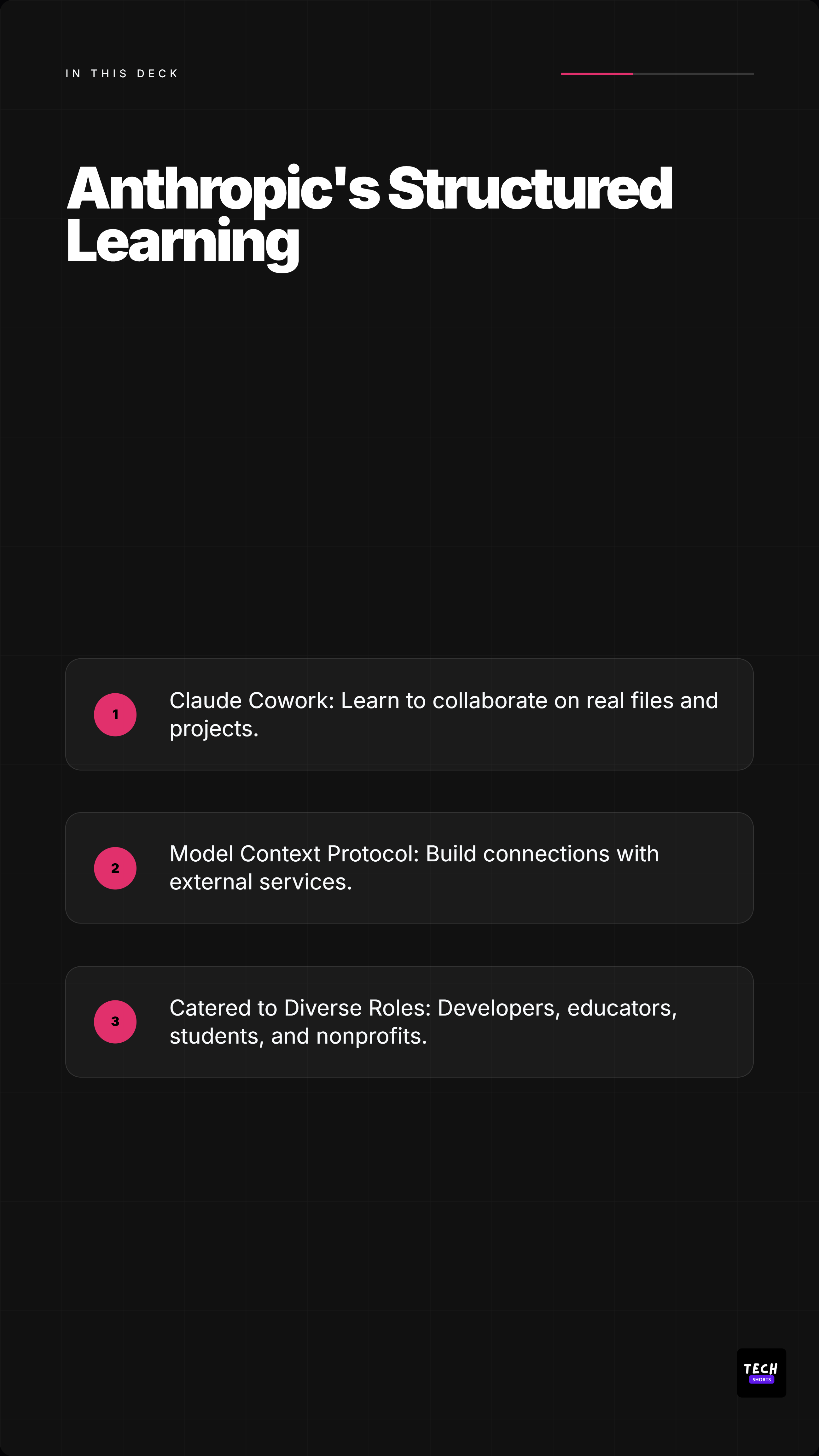
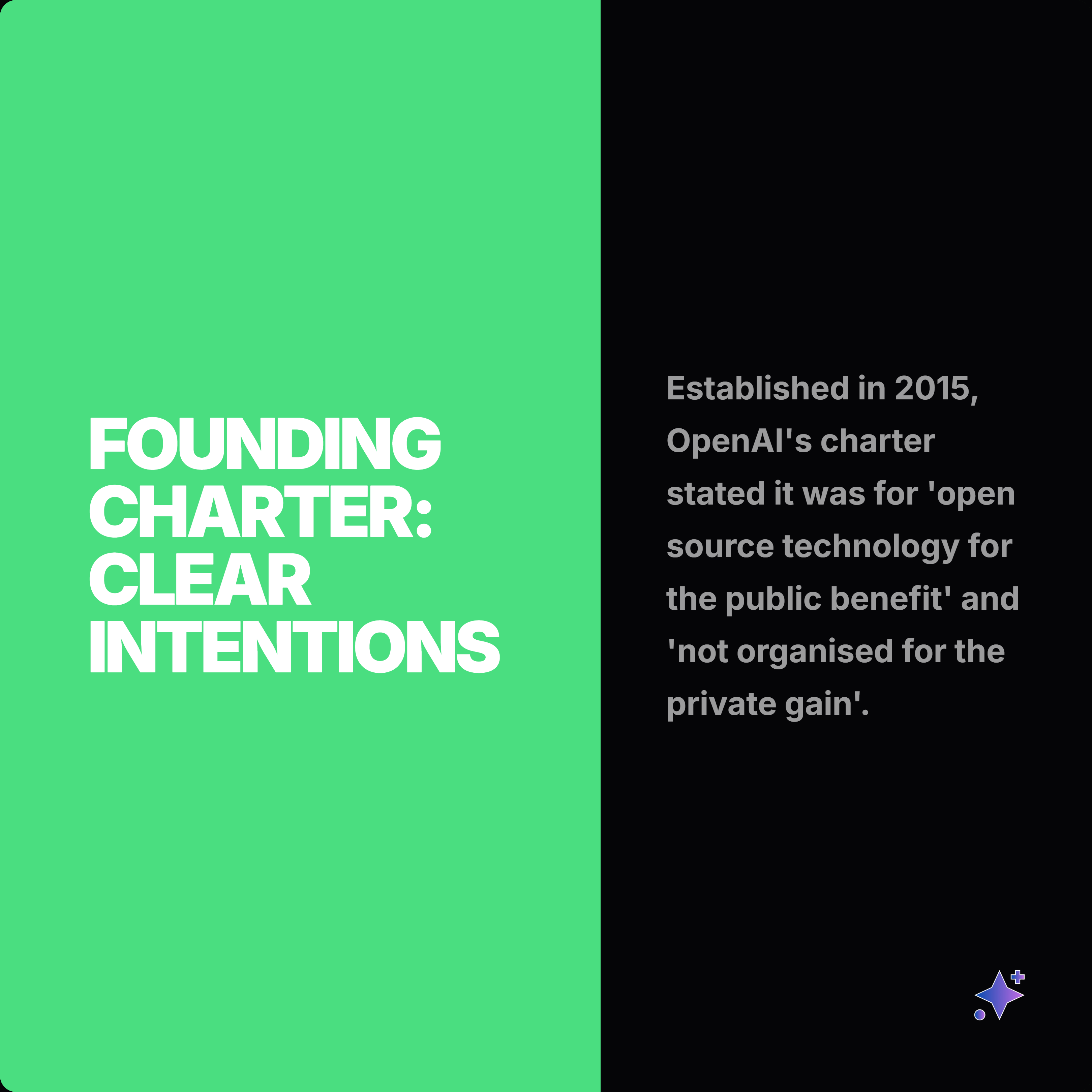
These complete rails show how one source can become a readable slide story, then split into smaller proof cards and captions.





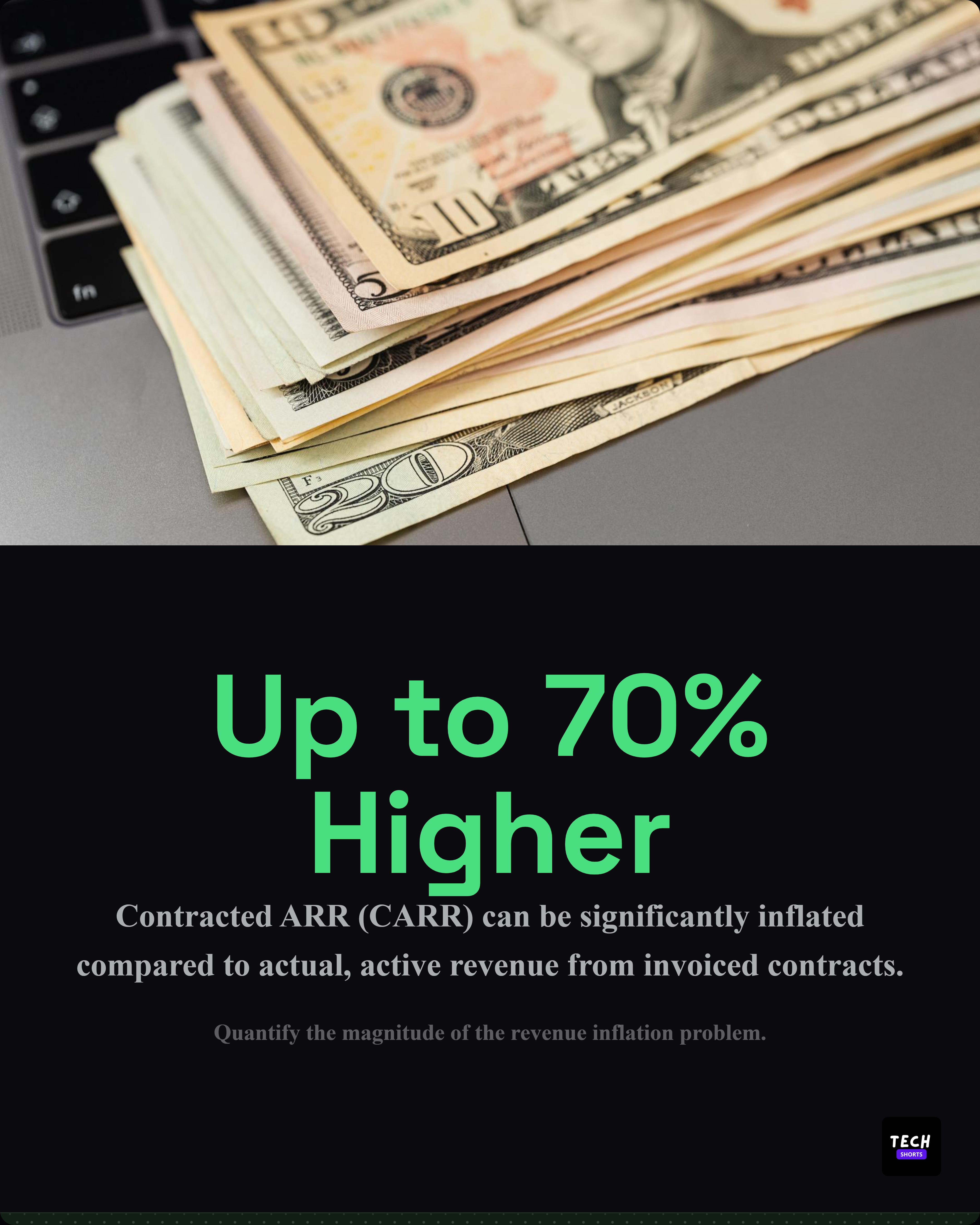
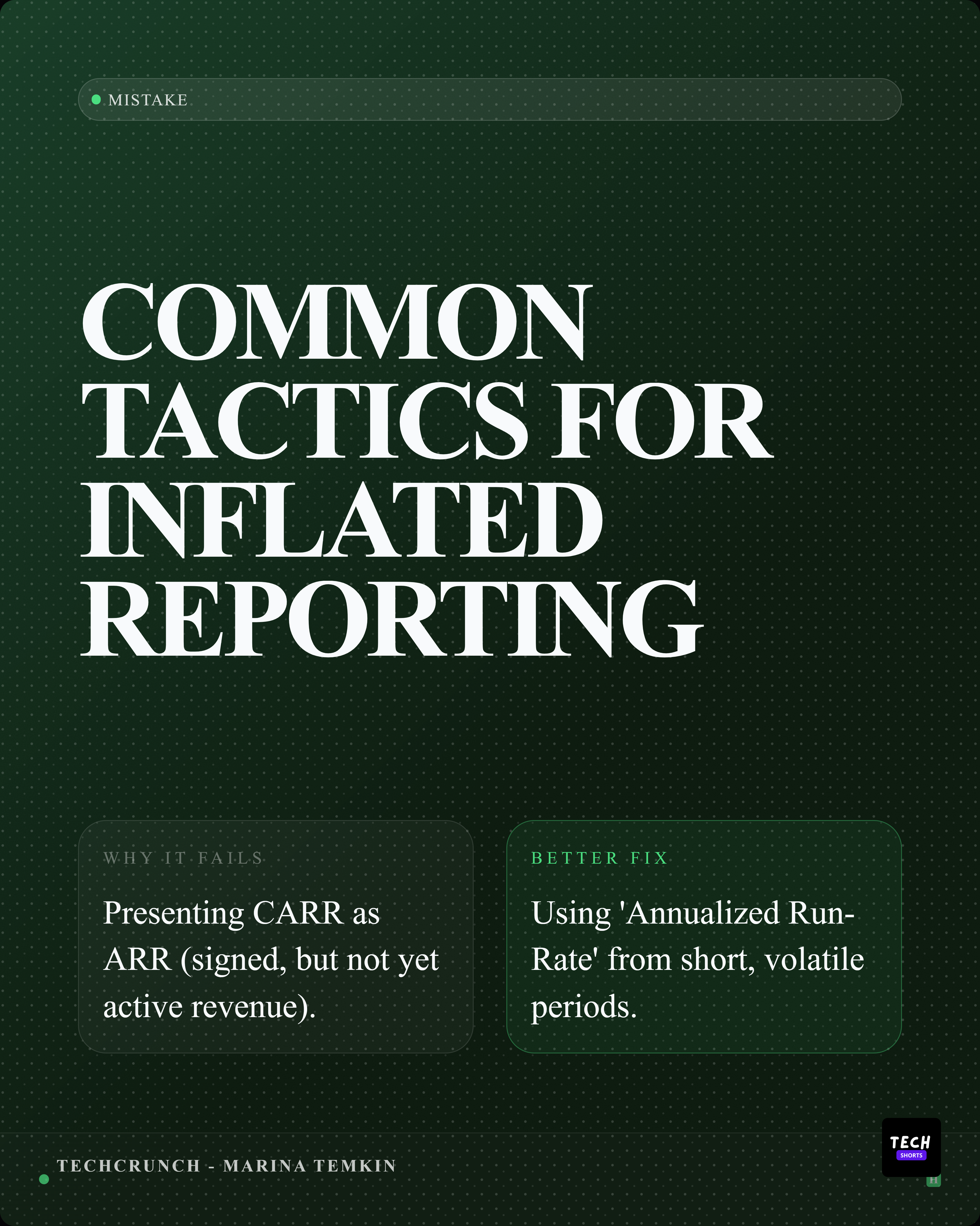
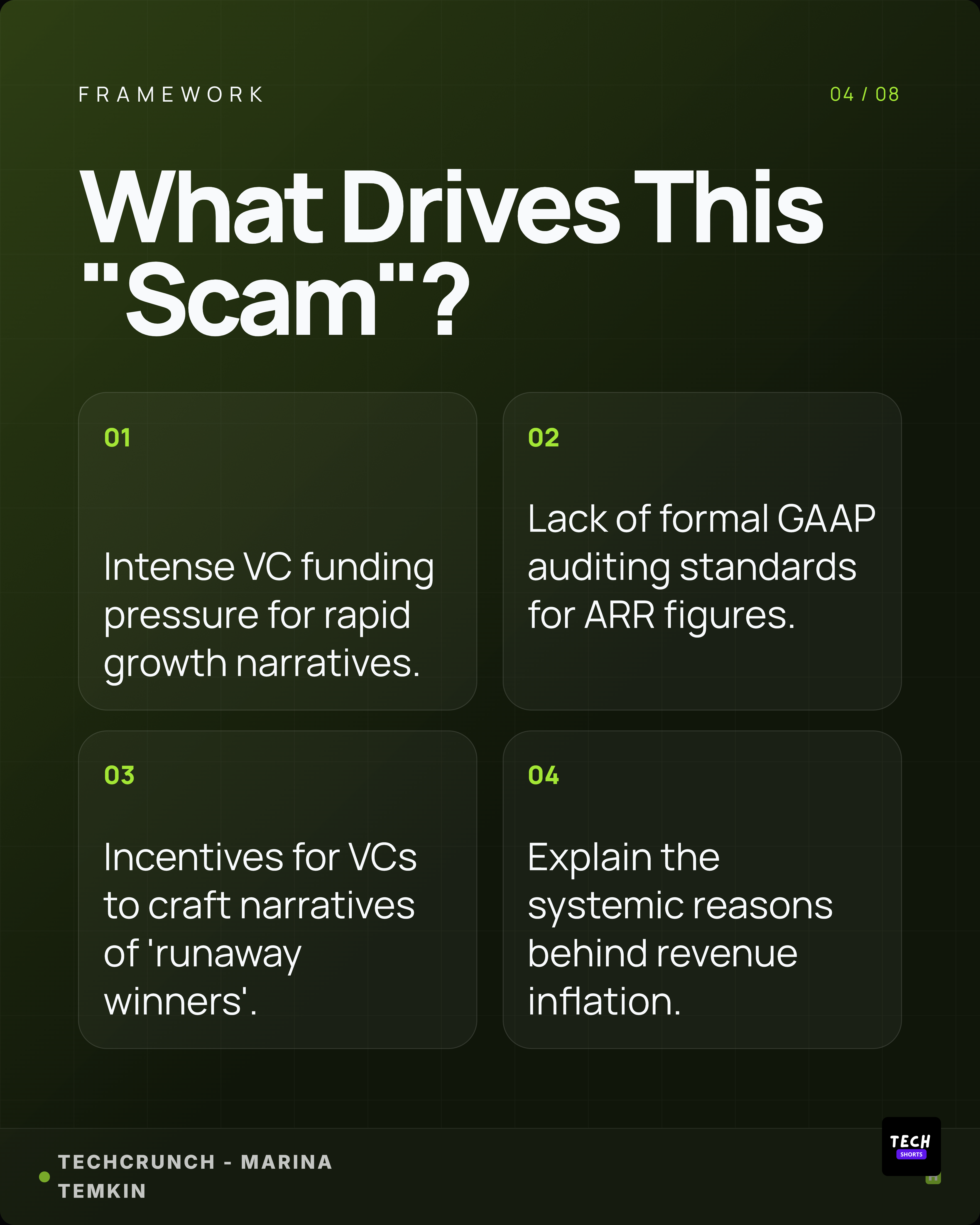
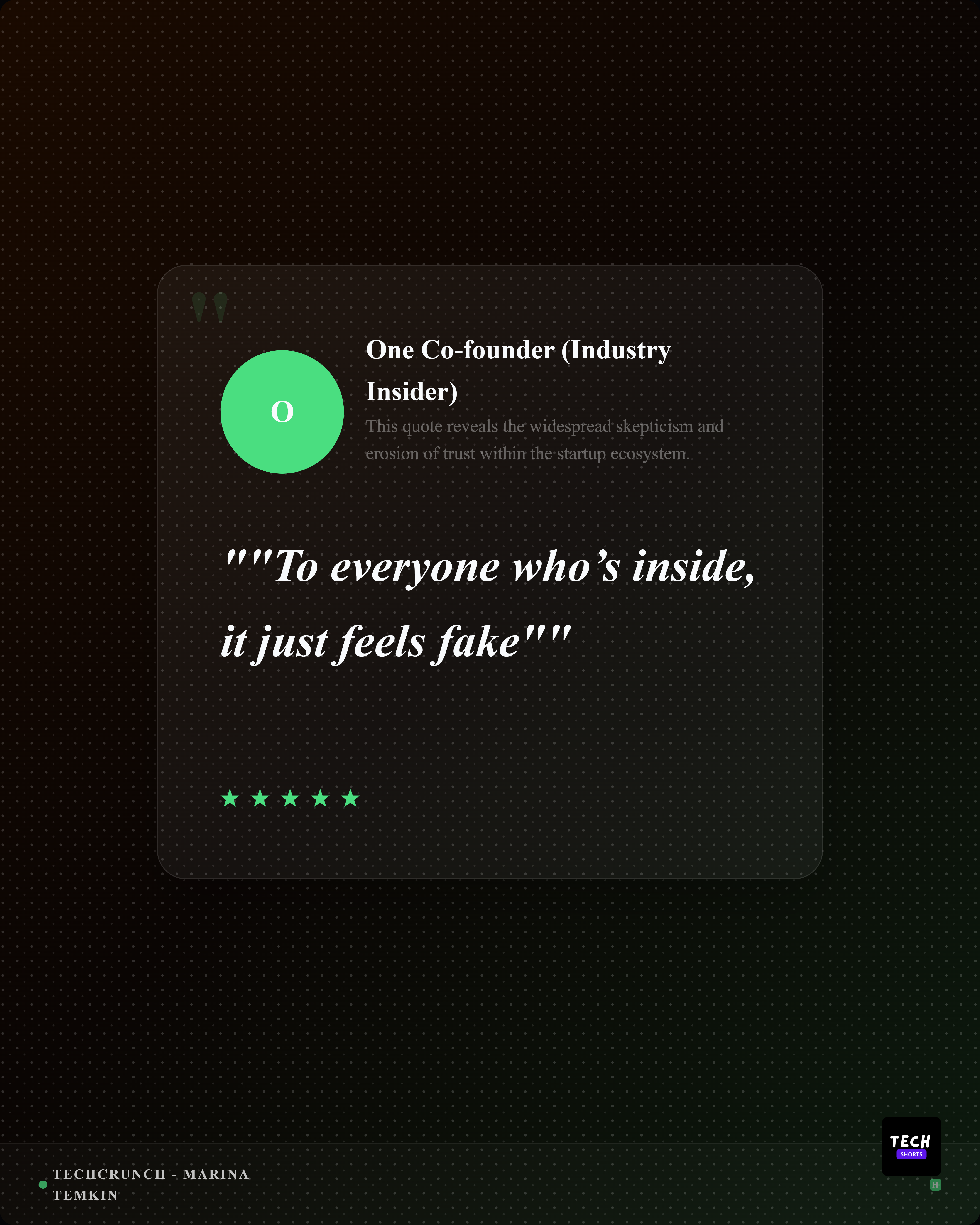








Best for
- Creators choosing between a single image, document carousel, screenshot, quote card, or stat card.
- Marketers resizing campaign graphics for LinkedIn feed posts and profile placements.
- Teams that want a repeatable LinkedIn asset system instead of guessing dimensions every time.
Not best for
- Treating dimensions as a substitute for a clear idea or useful source material.
- Cropping important text too close to the edge of a graphic.
- Using the same design unchanged across feed posts, carousels, banners, and covers.
Manual workflow
- 1Decide whether the post needs one image, a carousel, a screenshot, a quote, a stat, or a banner.
- 2Pick the size that matches the placement and reading behavior.
- 3Resize the artwork, check text legibility, and leave safe margins.
- 4Export a clean PNG, JPG, or PDF depending on the post type.
Highlightly workflow
- 1Start from the source material and choose the output type: quote card, stat card, screenshot, carousel, or caption.
- 2Generate assets in LinkedIn-friendly layouts and aspect ratios.
- 3Use brand kit controls for colors, typography, logo, watermark, and handles.
- 4Export polished LinkedIn assets without rebuilding the same idea from scratch.
Step by step
Choose the post job first
A single takeaway, a proof point, a product screenshot, and a step-by-step explanation should not all use the same format.
Match the format to reading behavior
Use document posts for sequences, portrait images for feed attention, square cards for reusable proof assets, and banners for profile context.
Keep text readable
LinkedIn is mostly mobile reading. Large type and clear spacing matter more than filling every pixel.
Export with intent
Use PNG or JPG for images and PDF for LinkedIn document posts or PPT-style slide sequences.
Research notes
What this answer is grounded in
Common questions
What size should a LinkedIn carousel slide be?
A practical LinkedIn carousel slide size is 1080x1080 because it works well for square document-style slides and keeps each page readable.
Is portrait better than square on LinkedIn?
Portrait posts can occupy more feed height, while square posts are reusable across more contexts. The better choice depends on the content and placement.
What format should I use for a LinkedIn document post?
Most teams design slides first, export them as a PDF, and upload that PDF as the LinkedIn document post.